-
Welcome! The TrekBBS is the number one place to chat about Star Trek with like-minded fans.
If you are not already a member then please register an account and join in the discussion!
You are using an out of date browser. It may not display this or other websites correctly.
You should upgrade or use an alternative browser.
You should upgrade or use an alternative browser.
Rethinking TMP....
- Thread starter Warped9
- Start date
The impulse housing isn't as wide as the TOS version, but it is taller and the exhaust ports are larger than the TOS ones.I think the aft end of the impulse assembly needs to be more rounded overall. Too squared off. I don't think the impulse drive should be smaller than in TOS. Maybe the same size. The top surface detail of the impulse assembly looks dynamite.
The aft ends of the nacelles are not easy and I would have to remodel the entire rear half of the nacelle along with the attatched detail.
I just decided to stop in on this thread and share some thoughts.
What Warped9 is doing here is remarkable, and has much potential. It can go in many different directions. It could blend with what we saw with TMP or with the recent "Phase II" fan films, or it could go in another direction entirely. It could be a 3D CGI outgrowth of conceptual sketches, or it could keep evolving into its own comprehensive vision, depending on one's aims.
Several years ago, Adam Turner, aka Icy_Penguigo, produced some pseudo-Star Fleet Universe art on this forum. One of Adam's project was something called "X-Technology", which looked like post-TOS, maybe TAS-era or post-TAS, but not quite TMP-era.
One of the renderings of this X-Technology was the Federation Starship U.S.S. Vincennes, NCC-1749. Vincennes had the basic shape of a Constitution-class starship, somehow in a weird though visually intriguing design limbo between TOS and TMP. It looked like the Federation and Klingons were experimenting with new technologies and coming up with prototypes, derived from existing FJ-style designs with some TMP design cues thrown in:
Vincennes - Image 1
Vincennes - Image 2
Vincennes - Image 4
Vincennes - Image 9
Vincennes - Image 10
Vincennes - Image 12
Vincennes - Image 15
Vincennes - Image 16
Vincennes - Image 18
Adam also produced some images of an X-Technology Klingon cruiser derivative of the D7 which looked like it could give the K'T'inga a run for its money.
I wanted to share these links in this thread because I though that, in some awkward way, what Adam was doing several years ago bears some resemblance to what is being discussed here.
I have always had very strong mixed feelings about what the TMP redesign did to alter the Enterprise's texture and profile (adding the new torpedo pods to the dorsal/"neck", the back-swept nacelle wings, the new nacelles, the new "dish", the new upper and lower saucer domes and the assemblies around them, the new lettering on the hull, the excessive "aztecing". But what Adam did seems, in many ways, superior to what TMP did... and the aborted "Phase II" in the late 1970s.
Just wanted to share...
Considering he's still working for Amarillo Design Bureau like he was when he made this model, I'm pretty it's "official" Star Fleet Universe.
")


I meant I understand your point about why the aztec pattern was used, but the resulting overall effect still doesn't work for me. No other Trek ship design (to my knowledge) ever used that again and didn't really suffer for it.
Am I misreading something? EVERY Trek ship from TMP onward has aztecing--including the nuPrise and how the TOS E was presented in the remastered CGI (albeit barely visible).
More pics. Starting to add windows (slightly re-arranged) and more subtle surface detail. Some surface detail is hard to see unless the light hits at the right angle and casts a shadow. Some detail is very subtle such as panels or hatches that are ever so slightly raised or recessed.
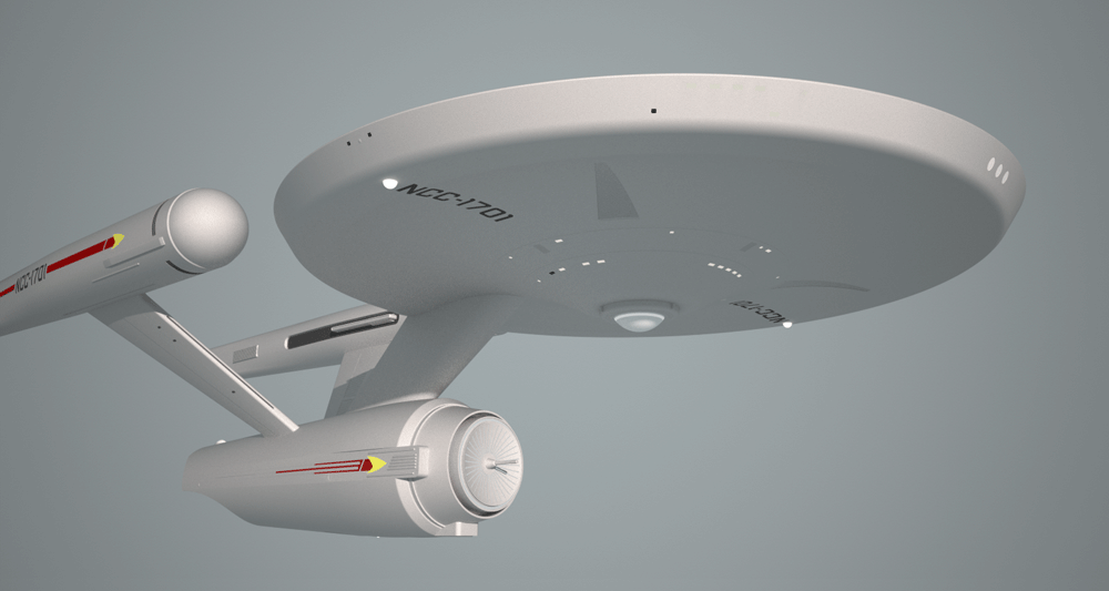
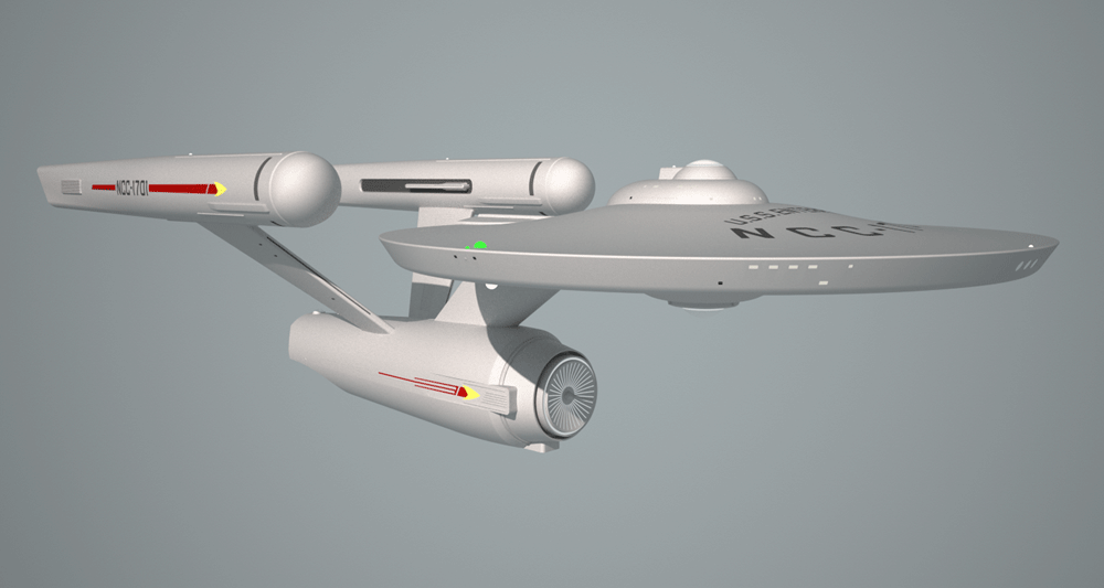
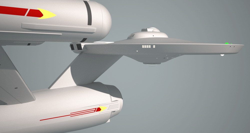
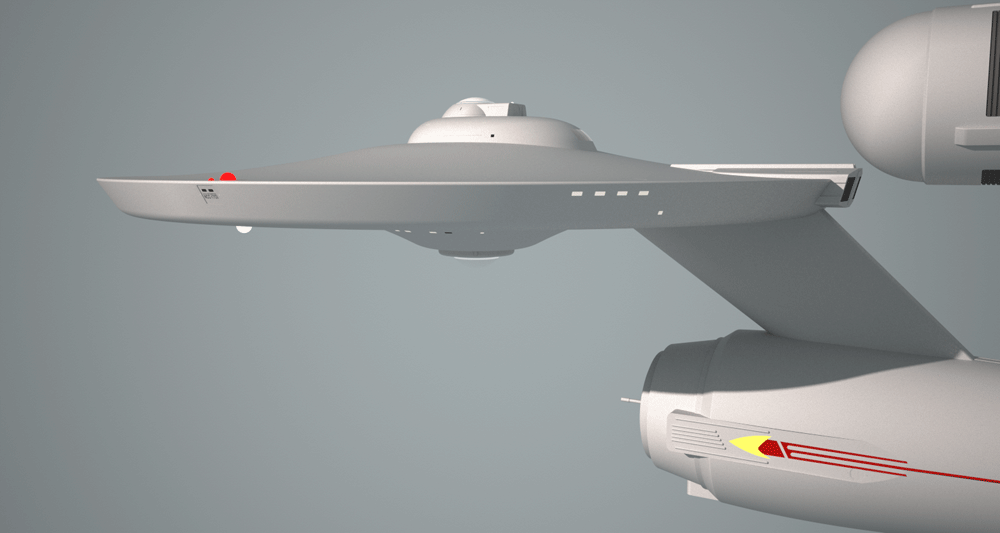
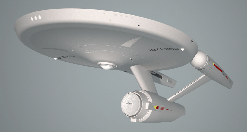
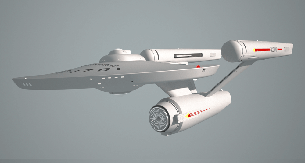
The triangles under the saucer have a corrugated texture to them and slightly recessed into the hull. The scallop under the saucer is a bit less severe than on the TOS 11 footer and much less severe than that on the TMP refit. The Main Crew Lounge windows have been added to the saucer's starboard side and the gangway access can be seen on the port side.


The triangles under the saucer have a corrugated texture to them and slightly recessed into the hull. The scallop under the saucer is a bit less severe than on the TOS 11 footer and much less severe than that on the TMP refit. The Main Crew Lounge windows have been added to the saucer's starboard side and the gangway access can be seen on the port side.
It's pretty good.
I think, due to Decker's "She's an almost totally new Enterprise," line, that you could afford to do ... something more. Though I know not what. Given your mission statement, I guess this is probably what you want it to be. In that case, well done.
--Alex
I think, due to Decker's "She's an almost totally new Enterprise," line, that you could afford to do ... something more. Though I know not what. Given your mission statement, I guess this is probably what you want it to be. In that case, well done.
--Alex
Maybe I should have called rethinking Phase II? Of course, if it had been for TMP then Decker's line would have had to be rewritten or cut entirely. ")
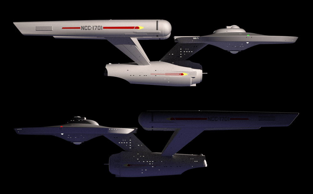
Of course, this all goes back to my initial intent: to fashion a design that could easily be recognized (particularly by fans dedicated to such things), without squinting, as the same ship we saw in TOS.
It will take on a different look when I finalize the colours, particularly the overall hull colour. There is also the matter of the nacelle domes which will require a bit of experimentation to get a reasonable facsimile of the effect I want.
Just my opinion, of course, but I still don't get why TMP replaced the boomerang-shaped Starfleet pennant with an evolution of the TOS uniform insignia turned sideways. If we're looking for purity of concept here, and there was no "canon" explanation ever offered for the change, I say keep the "old" pennant. How's that for nit-picky?
I almost did keep the old boomerang style. The pennant is slightly redesigned besides the arrowhead. The pennant on the secondary hull tapers aftward where the original did not.Just my opinion, of course, but I still don't get why TMP replaced the boomerang-shaped Starfleet pennant with an evolution of the TOS uniform insignia turned sideways. If we're looking for purity of concept here, and there was no "canon" explanation ever offered for the change, I say keep the "old" pennant. How's that for nit-picky?
Progress.
I'm getting there. There are still some small physical details I wish to add. Then there is the matter of colouring the main hull as well as colouring specific details. Finally there is the matter of the nacelle domes which will require some experimentation to get the effect I want.
I might also make some minor changes.

I'm presently working on the nacelle domes. Unfortunately SketchUp doesn't allow for animation, but I'm hoping I can still create the lighting effect I want for the domes.
A note about the weaponry. There are 7 phaser banks: 3 upper saucer, 3 lower saucer and 1 near bottom edge of the fantail cutout. I'm thinking of adding a 4th bank to the upper saucer.
The photon torpedo launcher is a hatch between the lower forward phaser and the lower sensor array section. I haven't given it much thought yet, but the photorp hatch could open to reveal 2 or 4 launchers depending on the size of the torpedoes. I don't envision the photorps to look like the coffin shaped things seen in TWOK onward. I like to imagine something more interesting.
nice. tho I agree with the sentiment that it is more "Phase II" than TMP.
Updating the hull markings to look closer to TMP might help make it look a bit more contemporary.
I like the designs done. Too bad ST NV/P2 didn't see what you're doing first before they did with their Enterprise. As for Star Trek and their retconning of the designation of the vessel class. It would've been more appropriate in leaving the Enterprise from Star Trek as Starship class, and making the so-called refit; clunkier version of the ship from TMP and call it Constitution class.Maybe I should have called rethinking Phase II? Of course, if it had been for TMP then Decker's line would have had to be rewritten or cut entirely.
Of course, this all goes back to my initial intent: to fashion a design that could easily be recognized (particularly by fans dedicated to such things), without squinting, as the same ship we saw in TOS.
It will take on a different look when I finalize the colours, particularly the overall hull colour. There is also the matter of the nacelle domes which will require a bit of experimentation to get a reasonable facsimile of the effect I want.
Your design is very much in the category of an appropriate Starship Class refit for me. Nice work, Warped9.
You know I don't actually mind the hull colour as is. It's magnesium with a hint of green that comes off as a light grey with some reflection. But I'm still playing with colours.
The nacelle domes are still not what I want yet so I've just photoshopped this dome effect onto the image.
But here we can get a clearer idea of how this might have looked like onscreen.
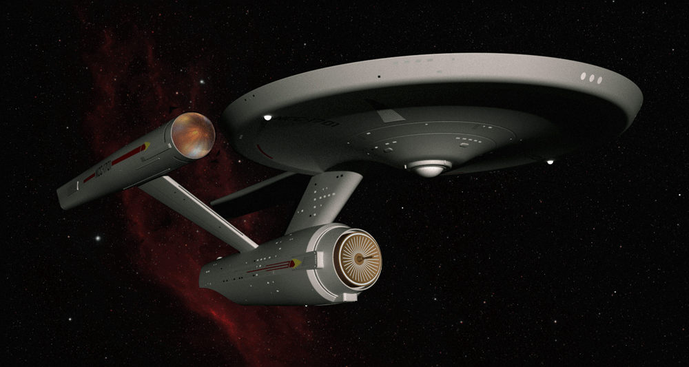
The nacelle domes are still not what I want yet so I've just photoshopped this dome effect onto the image.
But here we can get a clearer idea of how this might have looked like onscreen.

Similar threads
- Replies
- 132
- Views
- 4K
- Replies
- 22
- Views
- 3K
If you are not already a member then please register an account and join in the discussion!