-
Welcome! The TrekBBS is the number one place to chat about Star Trek with like-minded fans.
If you are not already a member then please register an account and join in the discussion!
You are using an out of date browser. It may not display this or other websites correctly.
You should upgrade or use an alternative browser.
You should upgrade or use an alternative browser.
Rethinking TMP....
- Thread starter Warped9
- Start date
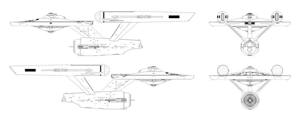
The aft part of the saucer rim has some very faint detail added on either side of the impulse housing. Indeed there is quite a bit of very subtle physical detail added in places all around the ship.Are you keeping the minimalist look of the saucer rim? Looks good!
EDIT: I can just see shadows of the TOS windows there, after all
Some of the lighted windows can get washed out if the light strikes the hull at the right angle. That reflected light can sometimes be brighter than the lighted windows.
Some images since I can't really think of what else to add here before moving on to the next subject.
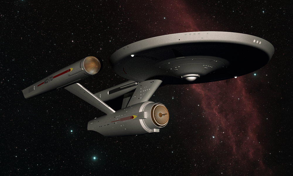
Onr thing that is apparent here is that I have not added gridlines, aztec-ing or gimmicky lighting (such as spotlights and surpuflorous engine effects). The idea was to freshen up the design while still being immediately recognizable.


Onr thing that is apparent here is that I have not added gridlines, aztec-ing or gimmicky lighting (such as spotlights and surpuflorous engine effects). The idea was to freshen up the design while still being immediately recognizable.
")

It's a different idea altogether. You basically have swapped the nacelles, building on Jefferies' idea of them being "quick change units". Jefferies' Phase II design was more involved - expanding both the primary and secondary hulls. The TMP "refit" is a refinement of Jefferies' Phase II design and has to be seen as such. More akin to the SCB-125 rebuild of the WW2-era Essex-class carriers than something like the complex overhaul of CVN-65 from 1979 to 1982.
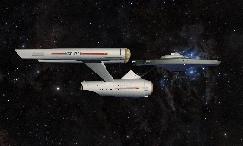
What isn't immediately apparent are the many subtle changes I made to the design. The nacelles and support pylons are merely the most obvious changes. But the saucer and the secondary are not identical to the original versions. The changes I made to both hulls allow for more interior space.
The upper and lower saucer curvatures are more gradual than those of the original. The secondary hull is a bit wider in diameter and does not taper as much as the original. I also added a bit more surface detail to the design to nail down certain things that were only alluded to previously because that physical detail did not exist on the 11 footer.
There is not much difference between "The Cage" version of the ship and the series production version. It was a matter of some added detail and some minor cosmetic changes. As such it's easy to accept it as the very same ship.
The changes from the series production version and the TMP are drastic to the point of being effectively an entirely new and different vessel. You have to do quite a bit of squinting and fudging to accept it as the same vessel we saw in TOS.
I can see the ship getting an extensive refit and upgrade after twenty some years of service, but I still wanted to recognize the ship sufficiently enough to believe it was the exact same ship. I wanted that sufficient degree of credibility.
In truth I was tempted to add more physical detail, but I chose restraint in order to maintain the TOS aesthetic overall.
"The changes from the series production version and the TMP are drastic to the point of being effectively an entirely new and different vessel. You have to do quite a bit of squinting and fudging to accept it as the same vessel we saw in TOS."
Actually, no. As I pointed out above, the Probert/Taylor work was just a refinement of Jefferies' own Phase II work. And as can be plainly seen by studying the Phase II work, it is an expansion upon the original, not something that starts from scratch. The issue with the TMP ship is it changes the graphics, the font, the finish, the colors... it changes everything on the surface AS WELL as tweaking the shape. When you look at the Phase II design, the graphics and fonts and colors pretty much are consistent with the original so it is easier to see the continuity. But if you look at the shape alone, the TMP and Phase II ships are quite similar. One is definitely a refinement of the other.
Actually, no. As I pointed out above, the Probert/Taylor work was just a refinement of Jefferies' own Phase II work. And as can be plainly seen by studying the Phase II work, it is an expansion upon the original, not something that starts from scratch. The issue with the TMP ship is it changes the graphics, the font, the finish, the colors... it changes everything on the surface AS WELL as tweaking the shape. When you look at the Phase II design, the graphics and fonts and colors pretty much are consistent with the original so it is easier to see the continuity. But if you look at the shape alone, the TMP and Phase II ships are quite similar. One is definitely a refinement of the other.
There are other issues. I never really cared for the "klingon style" nacelles even if they originated with Phase II. In elevation they aren't bad, but I don't like them in plan view. I also don't like a lot of the greebling that went onto the TMP refit. I also don't care for the more bloated looking secondary hull and the less severely angled edge of the saucer rim. There is also the fact the underside curvature of the saucer is more severe than that of the TOS design.
In short I'm of the minority that never really cared for MJ's Phase II revamp. I don't think it looks nearly as well integrated and visually balanced as what he did on TOS. It just doesn't work for me. That that design was "polished" for the better makes in work in of itself is fine, but I still much prefer the TOS version.
So this model is something of a crystalization of ideas I've had since 1979 on how I would have preferred to have seen the TOS Enterprise refreshed for either a second series or a feature film. I also allow I could have gone further with certain changes without losing my overall objective.
And now to consider the next subject for this thread:
Klingon Battle Cruiser
Starfleet Shuttlecraft
Space Station
Orbital Dry Dock

Before a shuttlecraft, think about a Travel Pod.
As far as a dry dock is concerned, I don't understand why it has to be a separate, stand-alone facility for each ship. Imagine a K-7-style space station with cage-like cradles that yawn open to let the ship out/in. The cradles could be underneath the inhabited pods of the station.
As far as a dry dock is concerned, I don't understand why it has to be a separate, stand-alone facility for each ship. Imagine a K-7-style space station with cage-like cradles that yawn open to let the ship out/in. The cradles could be underneath the inhabited pods of the station.
Hello, i know I may be repsonding to 2016 posts but I just signed on to this site, live in Toronto and am a modelbuilder. Planning to build a TOS and Refit version (-A) 3 ft enterprise with lights....been following Trekworks for a while and noticed that you wanted a model built. Are you still interested in something like this or did you already get it done last year from the US? I am a big fan of especially the old star trek.
Love your take on the enterprise. I like the TOS enterprise obviously because it was the first but I also like Proberts design because I think as an industrial designer he made it more elegant and balanced. I think the light blue colour sucks but there is not too much of it so its not that bad.
Love your take on the enterprise. I like the TOS enterprise obviously because it was the first but I also like Proberts design because I think as an industrial designer he made it more elegant and balanced. I think the light blue colour sucks but there is not too much of it so its not that bad.
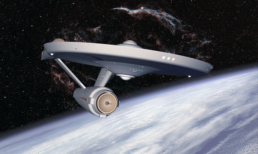
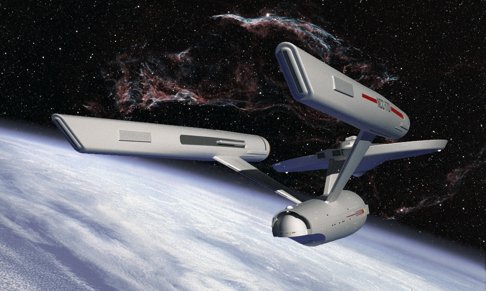
It isn’t that I forgot about this model, but it was put on the back burner while I dealt with some other things. I’d still like to address a couple of things I’m not wholly satisfied with such as the navigational deflector and perhaps the aft end of the nacelles. Overall, though, I think it came out pretty well. I’d like to do a few more renders.
The whole point of this exercise was to explore how the TOS E design could have been updated without radically altering it and thus look more in sync with what had come before.
The whole point of this exercise was to explore how the TOS E design could have been updated without radically altering it and thus look more in sync with what had come before.
Hey - be fair. The SNW Enterprise is still FAR better that the hideousness of the J.J. Drek versions...
(It's still a very poor substitute but...?)
(It's still a very poor substitute but...?)
The SNW design is just the latest fanbois exercise in today’s dark, edgy, graceless and distorted aesthetic layered over with a Star Wars’ born sensibility. The vastly oversized interior is also atrocious. This thing is sized more like the 1701D and yet viewers are supposed to expect it’s the same ship as the TOS E.
Thats seriously messed up.
Thats seriously messed up.
I love those line drawings.A different view.
Now, you had a far future Enterprise concept too as I recall
Similar threads
- Replies
- 132
- Views
- 4K
- Replies
- 22
- Views
- 3K
If you are not already a member then please register an account and join in the discussion!