• Welcome! The TrekBBS is the number one place to chat about Star Trek with like-minded fans.
    If you are not already a member then please register an account and join in the discussion!

Season 1 title font

Art Vandelay

Captain
Captain
For a long time now, I've been trying to identify a font (Google was unable to do so): The one that's used for the episode titles in season 1. It's not Horizon, that's only used outside of the credits in seasons 2 and 3.

Any help would be greatly appreciated - thanks in advance!
 
I'll bet it was a font created by the Desilu art department and it doesn't exist outside their shows.
 
Thank you, Tosk! That's really close but note quite the right font.
I also tweeted a graphics design acquaintance of mine yesterday, and he struck gold: the font's called Square 721 Bold BT. (Sometimes, the Extended Bold BT version was used.)
(Just to let you guys know I managed to resolve this.)
 
Thank you, Tosk! That's really close but note quite the right font.
I also tweeted a graphics design acquaintance of mine yesterday, and he struck gold: the font's called Square 721 Bold BT. (Sometimes, the Extended Bold BT version was used.)
(Just to let you guys know I managed to resolve this.)

Good info. I added it to my notes. :bolian:
 
Does anyone know when they switched to that font for the episode credits? The earlier 1st-season episodes used something closer to Helvetica Bold Extended.

1704112207100102.jpg
 
There's three distinct fonts. The Helvetica Extended font disappears after Charlie X (if you go by production order). Mudd's Women, right in between those, is the first to use the Square 721 font. After that, it alternates with a third font first used for The Galileo Seven and last seen in The City on the Edge of Forever. I've yet to identify that one.

Edit: The third font seems to be a member of the Trade Gothic family.
 
Last edited:
Interesting discussion; I have to admit, I never noticed there were multiple title fonts in season 1.

I used the title font from season 2 on my boat (wasn't sure I could get away with italics:)).

14vr3hy.jpg
 
Last edited:
For a long time now, I've been trying to identify a font (Google was unable to do so): The one that's used for the episode titles in season 1. It's not Horizon, that's only used outside of the credits in seasons 2 and 3.

Any help would be greatly appreciated - thanks in advance!

This is actually something that I've been intending to research for a while now, so thank you to the OP for posting this, and kickstarting me into actually looking into it! :techman:

I also tweeted a graphics design acquaintance of mine yesterday, and he struck gold: the font's called Square 721 Bold BT. (Sometimes, the Extended Bold BT version was used.)

Kudos to your friend! Of course, Square 721 is basically Bitsream's version of Eurostile (which itself was based on Microgramma). Since Bitstream was only founded in 1981, I'm guessing it was probably actually Eurostile that the graphics department used on TOS.

tos%20eurostile_zpsjyxoyepp.jpg


(Please note that the online font sampler I used to capture the examples didn't seem to give me the ability to adjust the letter tracking, so I couldn't modify it to match the title cards more exactly.)

The earlier 1st-season episodes used something closer to Helvetica Bold Extended.

Similar, but it doesn't appear to be specifically Helvetica... the 'K' in "The Naked Time" is pretty much a giveaway. I think Univers is a pretty good match, though.

tos%20univers_zpsbmmarayo.jpg


Interestingly, "Miri" appears to use a non-extended, oblique version, and seems to be the only episode to do so.

After that, it alternates with a third font first used for The Galileo Seven and last seen in The City on the Edge of Forever. I've yet to identify that one.

Edit: The third font seems to be a member of the Trade Gothic family.

I thought so too, but in doing a comparison, Trade Gothic doesn't appear to offer enough weight to match what we see, and there are differences in some of the letters, such as C and G.

tos%20trade%20gothic_zpsmm9kcbiz.jpg


So I decided to keep looking. I initially found some examples that looked really close, but turned out to have been designed in the 2000s, so they wouldn't have been available during the production of TOS.

I eventually managed to find one that I thought was possibly the answer: Standard CT. It was apparently first created in 1991, but it was a digital version of Standard, which had become popular initially in Switzerland in the 1950s.

tos%20standard%20ct_zpsxvz5mdqt.jpg


It seemed *really* close... but note the difference in the 'G'. Now, I don't know if possibly that's a difference between Standard CT and the original Standard. I have tried to find something about the original version to verify... but having such a generic name as "Standard" is not helping my searches any... especially since I don't actually know the original foundry.

So I continued looking, to see if I could find something similar to Standard CT, but with a G more like what I was expecting. And it turns out I was able to find something: Venus SB, which seems to have been designed in either 1907 or 1924, depending on what site you read.

tos%20venus_zpssaqbdrif.jpg


As you can see, it is *extremely* similar, and has some similarities that Standard CT doesn't. For example, note that there is less space between the top and middle bars in the E in the screen captures, compared to the middle and bottom bars. Venus SB has this feature too, whereas in Standard CT, the spaces appear to be equal.

But aggravatingly, there is still one minor difference visible: the horizontal bar in the G has an angled end in Venus SB, whereas it is straight in the screen captures. Now, I don't know if this is because TOS used a version from a different foundry, which didn't include this feature, or something like that. But it is a difference. I have tried to search out a typeface similar to this, but with the bar on the G matching the screenshots. So far, I have not yet had any further success... but that doesn't mean there's not something out there somewhere! I think I need to take a break from it for now, but if anyone else wants to continue searching, feel free... hopefully this will give you a good starting point!
 
Wow, great post Avro Arrow! I only have a casual interest in typefaces, but this is all very interesting.

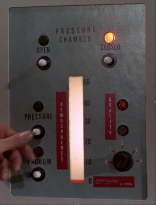
While we're on the subject, does anyone know what the typeface was used on a lot of the panel lettering, like this:
tos_lettering_zpsrjgtlpck.jpg


The alignment on some of the letters looks a little shaky, like maybe they were applied individually with a Letraset-type transfer, but I can't google up a match.
 
Wow, great post Avro Arrow! I only have a casual interest in typefaces, but this is all very interesting.

Thanks! :)

While we're on the subject, does anyone know what the typeface was used on a lot of the panel lettering, like this:
tos_lettering_zpsrjgtlpck.jpg


The alignment on some of the letters looks a little shaky, like maybe they were applied individually with a Letraset-type transfer, but I can't google up a match.

I'm certainly willing to give it a shot! :) First, I went to the high-res screencaps from Trekcore, just so I could see the letters at high enough detail to help with identification. The first episode I thought of with the pressure chamber was "Space Seed"... but turns out they apparently modified the original panel later in the show. But based on this close-up, it looks like the original version of the panel was done all in Univers:

tos%20pressure%20chamber%20univers_zpsqaf8o3c9.jpg


When they modified it for "The Lights of Zetar", then they added in different typefaces. The vertical text looks to be Trade Gothic, or something similar. I *think* the numbers on the new dial are also Trade Gothic, but to be honest those five digits are also very similar to Univers, so it's a bit difficult for me to tell the difference.

tos%20pressure%20chamber%20trade%20gothic_zpsldsnqby5.jpg


That just leaves the label in the bottom right corner. Admittedly, there's not a lot to go on here, but based on the 9 and the 6, I'm thinking Futura. Note that the first character after the dash appears to be a capital I, rather than a number 1. And obviously I can't tell the typeface of the rest of the tiny print on the label! ;)

tos%20pressure%20chamber%20futura_zpssynflrvz.jpg


And I especially like how they seem to have pencilled in decimal points on the measures beside the indicator when they changed the units from inches of mercury to atmospheres! :)
 
I was just wondering about the standard black on gray lettering, so what an extra-impressive reply! Many thanks again!
 
Avro Arrow, wow. That is some impressive research.
And thank you so much - this clears up everything and is a boon for an upcoming project of mine.
The only thing I'm still looking for is the episode title font for the Animated Series . That one has many similarities to Haettenschweiler, but R and S are off.
 
Last edited:
I was just wondering about the standard black on gray lettering, so what an extra-impressive reply! Many thanks again!

Avro Arrow, wow. That is some impressive research.

Thank you both! :)

The only thing I'm still looking for is the episode title font for the Animated Series . That one has many similarities to Haettenschweiler, but R and S are off.

Hmm, this one's being tricky. The closest I have been able to find to this one so far is something called Jay Gothic Bold. Unfortunately, it can't be that, because it wasn't designed until 1995. But it does seem to match the letters really well, including that S... except for R and G, unfortunately.

tas%20jay%20gothic_zpsbylncnki.jpg


I've been trying to search to see if I can find something that it might have been based on, that is similar, but matches the R and G. So far, no luck. (Although it does look like it may be derived from a slightly extended form of Compacta?) I'll try to look some more on the weekend, but if you want to try your luck, maybe this will give you a place to start! :)
 
It tickles me to see Univers, particularly in that 59 UltraCondensed weight. That's the exact thing my institution moved to in its logotype a couple years ago...to be trendy and modern! Everything old, new again.
 
I wonder if the inability to settle on a single font for season one factored into the decision to adopt the familiar font seen in the second season onward.
 
Has anyone identified which firm or firms did the titles/credits? If more than one, they might explain the variance right there.
 
Kudos to your friend! Of course, Square 721 is basically Bitsream's version of Eurostile (which itself was based on Microgramma). Since Bitstream was only founded in 1981, I'm guessing it was probably actually Eurostile that the graphics department used on TOS.

tos%20eurostile_zpsjyxoyepp.jpg


(Please note that the online font sampler I used to capture the examples didn't seem to give me the ability to adjust the letter tracking, so I couldn't modify it to match the title cards more exactly.)
That's especially fascinating since I think Eurostile Bold was used for the episode titles in Battlestar Galactica (TOS).
 
Has anyone identified which firm or firms did the titles/credits? If more than one, they might explain the variance right there.

I have a few memos indicating the Anderson Company handled titles/credits on the second pilot episode and at least some of the first season. Richard Edlund, who worked at the Westheimer Company, talks about doing many of the show's titles on The Roddenberry Vault.

So, there's at least two different firms which handled titles. It seems pretty likely that, like the show's visual effects, multiple firms were farmed out this work over the course of the series.
 
If you are not already a member then please register an account and join in the discussion!

Sign up / Register


Back
Top