I like the Beyond refit well enough but, man, that neck is so awkward looking (though I do like that it makes the ship look taller and prouder). Should have kept the original neck with (maybe) tweaked proportions. No need to make them look spindly and thin to make them more easily destructible because the Constitution configuration in and of itself is inherently weak at the neck and pylons.
The first trailer had the Into Darkness configuration:
This is a hell of a catch! This suggests that the (Beyond) refit was added late in post-production, after the 'A' had been reinstated and those scenes filmed (Hargreaves says the A was written into the script, then dropped, then reinstated). This better explains the odd choice to redesign the original ship only to replace it with the new A.
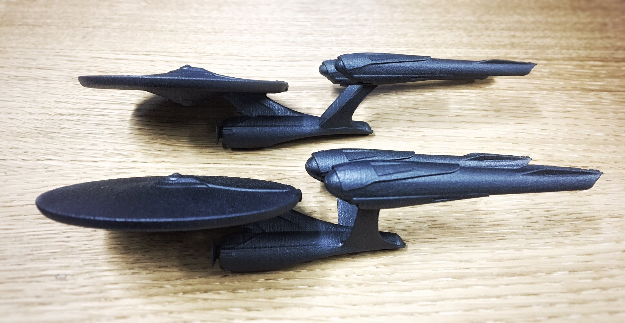
I tend to think of the Beyond version of the ship as being designed in forced-perspective. It looks much longer and sleeker from the front or back, but it's so weird and stubby from the top or side. It feels like the kind of redesign you can only get away with when you know you're only going to have a very limited number of shots with it and can do almost all of them from the ship's best angles.
I agree, and I tend to think that (like so much in these movies) we weren't supposed to notice. I think it's meant to be the exact same ship from the closing scene of ID.


") ).
).