• Welcome! The TrekBBS is the number one place to chat about Star Trek with like-minded fans.
    If you are not already a member then please register an account and join in the discussion!

Does anyone like TMP uniforms?

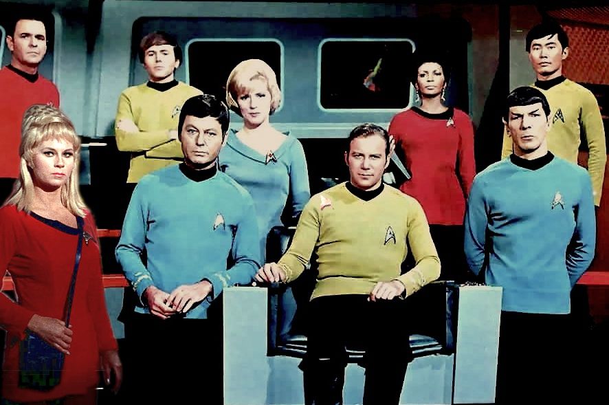
Pajamas was the term I've always resented by Nicholas Meyer when he saw Star Trek. Ignoring the concept wearing comfortable clothes would be appropriate for a space mission for an expanded amount of years. He thinks he's smart but even regular Naval ship's personnel are accustom to wear a duty uniform which would be comfortable. It would be improbable for a crew to wear dress uniforms for 5 years.

The reasons I feel about the 2 men's mindsets of Trek were different: Roddenberry actually served in the military so he knew about the subtleties of the military experience, while Meyer never served and his thoughts were more fantasy--envisioning an outfit which could never be practical in the military. His use of the word pajamas always felt like a snide toward TOS.
 
I like them but they could be better. I would have preferred it if there was more logic to the design and colour scheme. A consistent officer's uniform based on the admiral's design, with shoulder pads, epaulets showing rank, and boots would have been my preference, supplemented by blander uniforms for enlisted crew and slightly less figure-hugging overalls with pockets for technicians. I think I prefer the red security uniforms from STIII purely because the term 'red-shirts' should be preserved!
 
I like them but they could be better. I would have preferred it if there was more logic to the design and colour scheme.
There was a logic to the color scheme, but it wasn't as obvious as other uniforms. It kind of required either some inside information (mostly from production notes in The Making of Star Trek: The Motion Picture) or a lot of repeated viewings & scrutiny.
http://www.st-spike.org/pages/uniforms/2273-2277/uniforms.htm

Personally, I love the TMP uniforms and liked all the variants. To me, they seemed the most "realistic" uniforms for a futuristic space navy centuries from now.

Yes, I bought those fact files! But there is no obvious logic why Ilia wears grey and Sulu or DiFalco wears beige. Why Rand wears yellow while other engineering technicians and officers wear beige, grey, or white. The presented logic does not stack up on screen.
 
All in all I liked the design of TMP uniforms, I just do not like the lack of color. ...The whole TMP film was too grey and beige, I think if they and used the new uniforms but made the departmental colors...
Agree, the uniforms should have had colors connected to TOS.
 
I liked Admiral Kirk's uniform in TMP, and love how they modified it to look even cooler in ST2009/STID.

Beyond that though, I thought the uniforms in TMP looked like freaking pajamas, and preferred the II-VI uniforms. With TNG, the uniforms went back to looking like pajamas, even during the third season onward. First Contact onward kinda improved the uniform aesthetic a little bit, but they still looked (as the Klingons would properly phrase it) like "child's uniforms".

Yeah, the II-VI uniforms were the best, IMVHO. :)
 
Agree, the uniforms should have had colors connected to TOS.
I'm undecided. The TOS colour scheme was vibrant to take advantage of relatively new colour TVs but it also makes the show look camper. Maybe a splash of TOS colour would be ok somewhere on the uniforms but they already expanded department colours on the badges so you might end up with a lot of clashing colours. Maybe a coloured rim on the epaulets, around the edge of the badge and a stripe on the uniforms. Could get messy though. I think the uniforms look quite good when you line up the crew together in similar styled uniforms.

timeline-tos-cast4_zps1f3oaadc.jpg

tmp536890_955574204527191_4327405742746424573_n_zpskcdgbb3j.jpg


Pardon the dodgy photoshopping but putting them side by side, the TMP uniforms do look classier and more sci fi.
 
If anyone observe the designs of TMP uniforms, the departmental colors could've easily put in. There's an upper section by the neckline where the black can go. The rest of the color can be applied. The pants and shoes be colored black.

Also Kirk's tunic colors were green, not gold. I saw a wretched rendition of the bastardized NTSC colors photoshop done on TWOK uniforms. Maybe someone could produce the colors accurately for TMP uniforms.
 
If you look at Sulu and Uhura's uniforms, the ribbing on the tabards could lend themselves to a TNG style with black and the department colours although the bottom line is that they really need more than three colours... lumping engineering and security together never really made much sense, and the white medical uniforms look quite cool.
 
I'm undecided. The TOS colour scheme was vibrant to take advantage of relatively new colour TVs but it also makes the show look camper. Maybe a splash of TOS colour would be ok somewhere on the uniforms but they already expanded department colours on the badges so you might end up with a lot of clashing colours. Maybe a coloured rim on the epaulets, around the edge of the badge and a stripe on the uniforms. Could get messy though. I think the uniforms look quite good when you line up the crew together in similar styled uniforms.

timeline-tos-cast4_zps1f3oaadc.jpg

tmp536890_955574204527191_4327405742746424573_n_zpskcdgbb3j.jpg


Pardon the dodgy photoshopping but putting them side by side, the TMP uniforms do look classier and more sci fi.

Oh, how I love pictures that show all nine of them. Someone should do a thread somewhere of all known pictures that show all nine. I would, but I don't have any, just the ones I've found here that others have posted.
 
If anyone observe the designs of TMP uniforms, the departmental colors could've easily put in. There's an upper section by the neckline where the black can go. The rest of the color can be applied. The pants and shoes be colored black.

Also Kirk's tunic colors were green, not gold. I saw a wretched rendition of the bastardized NTSC colors photoshop done on TWOK uniforms. Maybe someone could produce the colors accurately for TMP uniforms.

I did try but I found that adding more colour does make them look more cheesy and cartoony. Also tried greying out the sleeves and pants - looks ok for the beige but dodgy for the grey and red just looks awful. It doesn't help that the pics are low res. I think trying to re-conjure TOS colouring is just trying to recapture a more comic book feel. While I'd prefer more consistency, I'm still erring on the side of the pastel shades until someone can convince me otherwise. It's possible that darker TNG colouring might work.
 
Personally, I like both iterations of Kirk-era movie uniforms. I rather like the design lineage that can be traced from Forbidden Planet, to the Cage, and finally to TMP. Plus, there's a sort of similarity of the TMP uniforms to the Wildfire jumpsuits in Bob Wise's The Andromeda Strain. I've never had a problem with the monochromatic color scheme, seems quite apt for a scientific working environment.

At the same time, I love the style of the monster maroons. Since they're quite similar in dramatic color to the red uniforms used by the British military in the 1800's (c.f. Cy Endfield's Zulu), I get the feeling Nick Meyer wished to evoke there. Two completely different approaches, but I like them both.
 
I'm undecided. The TOS colour scheme was vibrant to take advantage of relatively new colour TVs but it also makes the show look camper. Maybe a splash of TOS colour would be ok somewhere on the uniforms but they already expanded department colours on the badges so you might end up with a lot of clashing colours. Maybe a coloured rim on the epaulets, around the edge of the badge and a stripe on the uniforms. Could get messy though. I think the uniforms look quite good when you line up the crew together in similar styled uniforms.

Pardon the dodgy photoshopping but putting them side by side, the TMP uniforms do look classier and more sci fi.
This part of my thing with the TMP uniforms. I don't mind the style, save for the biobelt or whatever it's called. I've seen some interesting takes on the color scheme around these boards and it definitely improved it. I think a little bit of the TOS colors might have helped bridge the connection, even if they just were the same divisional colors.
 
Yes, I bought those fact files! But there is no obvious logic why Ilia wears grey and Sulu or DiFalco wears beige. Why Rand wears yellow while other engineering technicians and officers wear beige, grey, or white. The presented logic does not stack up on screen.
It kind of does, though. Sulu and DiFalco were strictly bridge officers, while it could be argued that Ilia was a command track officer (she might have otherwise being wearing beige like DiFalco). The gray "command" uniforms really seem more like a general officer's uniform with the others being more division-specific, IMO. Rand's uniform could just be chalked up to her belonging to a division that wasn't listed in those fact files notes.
 
I like to hope that enlightened and advanced humans hundreds of years from now won't be so self-conscious about body image.... though you would think that active members of the space navy would be required to maintain certain physical fitness standards.

Kor
The Media has even been trying to sell being overweight as "attractive," up to the point of Sports Illustrated (!!!) trying to get onboard with it. I can only imagine it's because of some larger concern about the dangers of anorexia, which are more extreme than the health hazards of obesity. If there is, in fact, this driving force in the STAR TREK universe to "better" oneself, then, surely, being in the best physical condition is where that journey begins. And uniforms like what The Motion Picture is suggesting is very much in line with such a philosophy and culture. And another reason I like them, actually.
 
If you are not already a member then please register an account and join in the discussion!

Sign up / Register


Back
Top