Rewatching Star Trek VI, I have to say I noticed a few things:
-The color grading and lighting were perfect, and sadly, none of the other films of the original cast match up to it. It could easily be a modern film.
-Special effects were perfect as well as sets.
-The costumes were on point, and their color seemed to be toned down from the 'lobster red' of the earlier films.
-The appearance of all the actors was perfect. Kirk, for the first time since The Motion Picture, actually looked what an older Kirk would look like: Perfect weight, face not any hint of flab (He looked kinda puffy in IV), no silly TJ hooker perm; McCoy looked great; Spock looked like Spock; no crazy afro on Uhura or her gheri curl like in the 80s films; Even Chekhov and Sulu looked dignified and classy, whereas in say, II, Chekhov was a still goofy but older version of himself.
It feels like every element clicked together in this film, and it makes me sad since this was the last with the original cast. It's like they fixed every aesthetic error which plagued the 80s films...but too late.
Also, going back to the color tones and image: I'm not an expert on color grading, but VI seems to have a perfect balance of colors to create a vibrant but not overly colorful image. The film stock seems to have been of higher quality too, giving a more crisp image.
Each film seems to have had its own unique color palette:
-The Motion Picture, being made in the 70s, has a very brown/Earth tone color set
-II seems to be very harsh, red and browns and harsh colors.
-III and IV seem to be very blue in terms of the color grading, especially IV, I suppose going with the ocean theme of the film
-V is all over the place
If someone who is more of an expert on color grading/timing could weigh in and explain what I said better, I'd appreciate that.
But does anyone else agree that not only does the cast look the best in VI out of the films, but that the other aspects I mentioned were finally "just right"?


Kirk literally looks just like an older, dignified version of the guy we saw back in 1966 here.
Same for Uhura and Chekhov


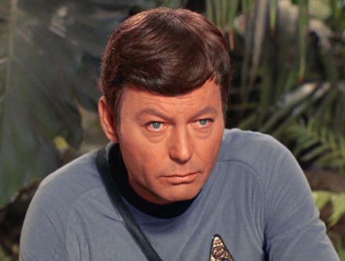
Grumpy old Bones is Grumpy old Bones - perfect


Compare say to themselves and the look of IV:


Or II


Or I:


-The color grading and lighting were perfect, and sadly, none of the other films of the original cast match up to it. It could easily be a modern film.
-Special effects were perfect as well as sets.
-The costumes were on point, and their color seemed to be toned down from the 'lobster red' of the earlier films.
-The appearance of all the actors was perfect. Kirk, for the first time since The Motion Picture, actually looked what an older Kirk would look like: Perfect weight, face not any hint of flab (He looked kinda puffy in IV), no silly TJ hooker perm; McCoy looked great; Spock looked like Spock; no crazy afro on Uhura or her gheri curl like in the 80s films; Even Chekhov and Sulu looked dignified and classy, whereas in say, II, Chekhov was a still goofy but older version of himself.
It feels like every element clicked together in this film, and it makes me sad since this was the last with the original cast. It's like they fixed every aesthetic error which plagued the 80s films...but too late.
Also, going back to the color tones and image: I'm not an expert on color grading, but VI seems to have a perfect balance of colors to create a vibrant but not overly colorful image. The film stock seems to have been of higher quality too, giving a more crisp image.
Each film seems to have had its own unique color palette:
-The Motion Picture, being made in the 70s, has a very brown/Earth tone color set
-II seems to be very harsh, red and browns and harsh colors.
-III and IV seem to be very blue in terms of the color grading, especially IV, I suppose going with the ocean theme of the film
-V is all over the place
If someone who is more of an expert on color grading/timing could weigh in and explain what I said better, I'd appreciate that.
But does anyone else agree that not only does the cast look the best in VI out of the films, but that the other aspects I mentioned were finally "just right"?
Kirk literally looks just like an older, dignified version of the guy we saw back in 1966 here.
Same for Uhura and Chekhov
Grumpy old Bones is Grumpy old Bones - perfect
Compare say to themselves and the look of IV:
Or II
Or I:
