-
Welcome! The TrekBBS is the number one place to chat about Star Trek with like-minded fans.
If you are not already a member then please register an account and join in the discussion!
You are using an out of date browser. It may not display this or other websites correctly.
You should upgrade or use an alternative browser.
You should upgrade or use an alternative browser.
ST5 - Unused Uniforms
- Thread starter Aeronnaex
- Start date
I really like this idea! The belt doesn’t really looks right yet, but that’s certainly just due to the quick removal of the delta.
Of course, the insignia buckle is probably presented when a cadet graduates from Starfleet, since Khan wears Marla McGivers' one as a pendant in ST II, even though her smaller, original uniform insignia (in TOS) was made of metallic gold leatherette.
")
As an aside, it is my creation, so thanks for that.
Most humbly beg forgiveness for my snark. Going to dig myself a deep hole now.
In fairness, it does look a lot better as a patch. The rectangle backing really doesn't serve the overall shape.
Of course, the insignia buckle is probably presented when a cadet graduates from Starfleet, since Khan wears Marla McGivers' one as a pendant in ST II, even though her smaller, original uniform insignia (in TOS) was made of metallic gold leatherette.
I get that you're probably joking, but was that ever suggested in beta canon? I always presumed it was a continuity error; he was supposed to take it from the Reliant but the costumers put it on him for his introduction. Whoops.
He did like his Starfleet trappings, like wearing the Reliant crew's coats as cloaks.
And I never realized this before, but she's not wearing Chekov's coat. Belongs to a lieutenant.
I really like this idea! The belt doesn’t really looks right yet, but that’s certainly just due to the quick removal of the delta.
Thanks! I was trying to subtly reflect the trapezoidal shape of the back belt loop. And in brass instead of gold, so it wouldn't steal focus from the delta.


Yeah, I'm not a fan of duplication of insignia/emblems. Like when they they put the \S/ on Superman's belt.
And don't get me started on the pointless Kelvin/Discovery/SNW "cover everything in Deltas" mess....
Last edited:
Ah. Cool!Thanks! I was trying to subtly reflect the trapezoidal shape of the back belt loop. And in brass instead of gold, so it wouldn't steal focus from the delta.
indeed! Always reminds me of the story about Steve Jobs having the apple logo removed from most places to avoid “diluting” it, way back in 1983.And don't get me started on the pointless Kelvin/Discovery/SNW "cover everything in Deltas" mess....
Slightly better. The sleeve stripes is one other thing I would remove.Thanks! I was trying to subtly reflect the trapezoidal shape of the back belt loop. And in brass instead of gold, so it wouldn't steal focus from the delta.
I kind of like the one colored stripe on the left sleeve to balance out the strap on the right, but I hate the pips and squeaks. My version would move the rank pin down to the stripe. Just streamlining the thing.

That looks a bit better than I'd have guessed, but I still prefer to have a bit of white behind the delta. As Maurice pointed out above, your eye is automatically drawn to the area of greatest contrast, and white always contrasts nicely with a bright color.Except... the rectangular piece obscures the design and makes it pop less. At any distance, it's a shapeless blob, the bronze delta totally lost against the bright rectangle.
I'm not sure at all that a gold badge needs a white background to pop; it needs contrast. And the gold parts of the TWOK badge stand out just fine against the red wool. A gold badge like Admiral Kirk wore would have plenty of contrast on the maroons.
Edit: something like this.

Yep. That just horribly dilutes the costume and draws your eye away from the chest emblem.Yeah, I'm not a fan of duplication of insignia/emblems. Like when they they put the \S/ on Superman's belt.
I don't mind the repeated emblem on the monster maroons, though. The black belt makes it fade back enough to as to not be distracting, IMO.
Yeah. I'm SO sick of laser-etched emblems everywhere on Trek uniforms and superhero costumes in movies. It's distracting as hell and it's really going to date those projects in later decades. But it's still the trendy thing of the moment.And don't get me started on the pointless Kelvin/Discovery/SNW "cover everything in Deltas" mess....
I like that slightly better but honestly I would just loose the white strap and just due rank stripes across the sleeves. Plain sleeves just don't appeal to me.I kind of like the one colored stripe on the left sleeve to balance out the strap on the right, but I hate the pips and squeaks. My version would move the rank pin down to the stripe. Just streamlining the thing.
I'd be happy to put rank stripes on the sleeves - really hate all those arbitrary rank shape pins. But then the shoulder strap needs something.
Not sure white really contrasts with gold, though. That's the whole point behind the Rule of Tincture, you need some separation between whites and yellows. I honestly think the gold badge would pop a lot better against the dark red wool.
I'm pretty sure the deltas would have been distracting.

EDIT: I dunno, what do you think about these?

That looks a bit better than I'd have guessed, but I still prefer to have a bit of white behind the delta. As Maurice pointed out above, your eye is automatically drawn to the area of greatest contrast, and white always contrasts nicely with a bright color.
Not sure white really contrasts with gold, though. That's the whole point behind the Rule of Tincture, you need some separation between whites and yellows. I honestly think the gold badge would pop a lot better against the dark red wool.
Ah, that's just because the lighting was so dark in that scene. If they turned the lights up pastI don't mind the repeated emblem on the monster maroons, though. The black belt makes it fade back enough to as to not be distracting, IMO.
"hide the old-age makeup" level,
I'm pretty sure the deltas would have been distracting.
EDIT: I dunno, what do you think about these?
Last edited:
Hey, @McCoy's Disco Collar, could you NOT post unhidden screencaps from STRANGE NEW WORLDS in the thread, please? We're not beyond the six month spoiler window yet.
https://www.trekbbs.com/threads/you...-picard-or-snw-spoilers.308782/#post-14141310
https://www.trekbbs.com/threads/you...-picard-or-snw-spoilers.308782/#post-14141310
needed to be just a bit longer and a little loose fitting so it was a tunic top. combined with, as @McCoy's Disco Collar says, black trousers, and you have a simple working day to day uniform. By the time of Jack Crusher (and young Picard as well, obviously) the turtleneck was gone.God, that bland, shapeless, beige t-shirt with the huge belt buckle practically screams "I was designed in the 1970s!!!" to me.
By that point maybe arguably it WAS a dress uniform (even now, there are degrees of dress uniform ), as well as something Cadets had to wear. Look at the throwback uniforms worn at Annapolis and West Point now.
During the TNG-DS9-VOY-LowerDecks era there were at least two concurrent uniform designs going on at any one time, sometimes perhaps three. TMP likewise shows the comm station crew wearing slightly different uniforms. Beyond has the Yorktown officers wearing something different, etc. It's likely the monster maroons weren't the only uniform during those decades but just happened to be used in certain circumstances the entire time.
I agree and I think your example is a decent addition. I lack the editing skills but I would be curious to try it without the strap but still the flap.I'd be happy to put rank stripes on the sleeves - really hate all those arbitrary rank shape pins. But then the shoulder strap needs something.
I found a couple of variants I like, mostly for the color though they haven't messed with the strap...
Starfleet Marine uniforms: created by this boards @TemporalBeard, who has some of my favorite fan designs:

From this fan site there is a huge variety of uniforms for differerent branches. The intelligence branch uses black and white as their department color:

But the flap and the strap endure. I am not certain what to redo it with.
I agree that the Monster Maroon is definitely a good dress uniform. I think utilizing the undershirt as a daily work uniform would be appropriate.needed to be just a bit longer and a little loose fitting so it was a tunic top. combined with, as @McCoy's Disco Collar says, black trousers, and you have a simple working day to day uniform. By the time of Jack Crusher (and young Picard as well, obviously) the turtleneck was gone.
Did you make these? They look pretty cool. What did you use GIMP, photoshop, etc? I have tried to do similar things but I find trying to recolor something seems to require tedious retracing of pixels. As clean and authentic as these look, it suggests you have some kind of tool that kind-of "knows" the border between patches of color and can recolor just those portions.I'd be happy to put rank stripes on the sleeves - really hate all those arbitrary rank shape pins. But then the shoulder strap needs something.
Not sure white really contrasts with gold, though. That's the whole point behind the Rule of Tincture, you need some separation between whites and yellows. I honestly think the gold badge would pop a lot better against the dark red wool.
Ah, that's just because the lighting was so dark in that scene. If they turned the lights up past "hide the old-age makeup" level, I'm pretty sure the deltas would have been distracting.
EDIT: I dunno, what do you think about these?
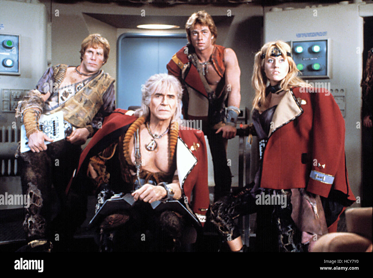
We actually do know that the TMP uniforms were able to take a maroon, blue, or some-kind-of-tan-gold-whatever from an article in Star Trek the Magazine, and that the jackets were made to match that color. Meyer just only used the red color because he thought it looked the best. The blue and gold versions could have existed, they just didn't onscreen. This image sort of matches what might have been. The blue looks particularly convincing to me.
However, I do think that using all-white sweaters kind of breaks the continuity with the pilots to TMP. I'd love to see what they look like with black sweaters and straps, which would look at bit more like TOS and also bring the number of fabric colors on the uniform down from three to two. That also would create a nice progression to the TNG uniforms. I cannot explain why, but the gold jacket looks more like an operations division uniform than a command uniform, even though that is a TMP-TNG thing and not a TOS thing. It would be weird to have Kirk be a redshirt in command like Picard or Sisko.
Hey, @McCoy's Disco Collar, could you NOT post unhidden screencaps from STRANGE NEW WORLDS in the thread, please?
I'm so embarrassed. Of course, my apologies to all.
Thank you, McCoy's Disco Collar, for putting up the spoiler tags. Also, please make sure you're not hotlinking images. All that said, I like the "monster maroons" in TOS colors.
So, I've been musing over this a little bit trying to figure out a way to make the design work. As far as these go, I think they are a step in the right direction, though I would reduce the size of the belt buckle, as it looks a bit uncomfortable.EDIT: I dunno, what do you think about these?
And I had a random idea that I have no idea if it would work but I wanted to revisit this design with a specific idea to go along with it. The biggest thing I do not care for is the strap though looking at the design here it works better. So, I was thinking of possible designing an undershirt that is two toned, so like the TNG style, with a black color that would be worn under the uniform jacket as part of a dress uniform, but worn for on duty work. The rank stripes could continue but be on the sleeves vs. the strap of the jacket.
Again, random thoughts, not necessarily going to work.
agreed: as it is it shows that there was the insignia on it.So, I've been musing over this a little bit trying to figure out a way to make the design work. As far as these go, I think they are a step in the right direction, though I would reduce the size of the belt buckle, as it looks a bit uncomfortable.
Also I think that the delta would work better in silver instead of gold, especially on the command uniform.
I could certainly play with a silver delta, but the belt buckle never had any insignia on it at all. That's a brand-new shape, and the trapezoid is actually less tall than the round delta buckle on the actual costume.agreed: as it is it shows that there was the insignia on it.
Also I think that the delta would work better in silver instead of gold, especially on the command uniform.
At first blush, I rather like the silver. That's a good call.

Last edited:
I agree. Honestly, I was thinking it would be fun to utilize the Kelvin Universe Dress uniform Delta on the maroons design. I've been looking at those dress uniforms for other possible elements.agreed: as it is it shows that there was the insignia on it.
Also I think that the delta would work better in silver instead of gold, especially on the command uniform.
my mistake then! It still looks incomplete to me as it is, though.I could certainly play with a silver delta, but the belt buckle never had any insignia on it at all. That's a brand-new shape, and the trapezoid is actually less tall than the round delta buckle on the actual costume.
An idle thought…what about putting the department symbol on it? I’m not too sure about the command arrow, but I suspect that the science eye and engineering whatever that is would fit nicely.
that was fast. I like it!At first blush, I rather like the silver. That's a good call.
By the way, I like a lot the way you put those rank stripes on the shoulder strap.
Similar threads
- Replies
- 187
- Views
- 10K
- Replies
- 3
- Views
- 286
- Replies
- 0
- Views
- 125
If you are not already a member then please register an account and join in the discussion!