• Welcome! The TrekBBS is the number one place to chat about Star Trek with like-minded fans.
    If you are not already a member then please register an account and join in the discussion!

"Next Voyage" Font

GSchnitzer

Co-Executive Producer
In Memoriam
Is there anyone here knowledgeable about fonts (old 1960s fonts) who can identify this font used in the Star Trek previews through the first and second seasons?

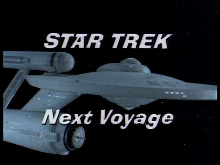
The cross at the top of the "A" and the squared off openings in the a, e, o, and r, are odd and might provide clues.

Star+Trek+Next+Voyage.png
 
Are we sure this was part of the original NBC broadcast, and not just created for 1980s home video releases?

It looks hand-made to me, like somebody cut those letters out of paper with a pair of scissors. If that's the case, there's no such font. And that would almost have to be an original (1960s) situation.
 
^ I agree. The duplicates of certain letters are different to each other, so probably hand-made.
 
Are we sure this was part of the original NBC broadcast, and not just created for 1980s home video releases?

It looks hand-made to me, like somebody cut those letters out of paper with a pair of scissors. If that's the case, there's no such font. And that would almost have to be an original (1960s) situation.

Interesting.

Well, there were "here are some scenes from next week's Star Trek" previews even when the episodes aired originally--and some of these previews use footage that wasn't actually in the episode. I'm not sure where someone would get that unused footage if these weren't done back contemporaneously with the series. But the notion that this graphic might have been appended later is interesting.

I note that the "Star Trek Next Voyage" graphic for the third season previews use the regular blue Star Trek font. I wonder why the change if these were done years later.
 
The trailers themselves were cut under Bob Justman's supervision during the run of the show (I'm not sure who cut the trailers once he left the series), and were aired on NBC.

We know from archival records that the opening text on the trailers originally read "NEXT WEEK" during seasons one and two, but was revised to "STAR TREK NEXT VOYAGE" in season three.

See this film clip from the original trailer for "The Devil in the Dark," for example: https://www.flickr.com/photos/birdofthegalaxy/4294036557/

This matches the episode's credits memo at UCLA.

Presumably, the trailers were standardized to "STAR TREK NEXT VOYAGE" for weekly strip syndication following the show's cancellation.

I have no idea about the font -- the credit memos do not say.
 
At that time would it even still have been a "font"? Could have been hand drawn or cut from paper, as someone else suggested?
 
^ Well, the concept of a matched set of characters in a font or a typeface goes back to the Middle Ages.

For use in a fan film, maybe somebody could trace those letters from a TOS screenshot and convert them into a vector graphic to insert over the new video? But I don't really know much about such things. :shrug:

Kor
 
In the '60s, companies like Letraset making sheets of dry transfer letters that you could use to make signs or advertisements in newspapers. I used them shortly after that time working part-time at an ad agency. The studio was probably capable of even making their own in their print shop.
 
Most titles were done by outside companies like Pacific Title rather than at the studios themselves.
 
I note that the "Star Trek Next Voyage" graphic for the third season previews use the regular blue Star Trek font. I wonder why the change if these were done years later.

All I know is, I never saw the graphic posted at the top of this thread until the pre-recorded VHS tapes came out.

I missed the first run on NBC, and the only trailer I ever saw in syndication was for "The Menagerie," and that only once. I remember how jarring it was when Spock's voice suddenly came on saying "Leonard Nimoy speaking!" and he said something like, don't miss the thrilling conclusion next week (which was really going to be tomorrow at that point).
 
^ Well, the concept of a matched set of characters in a font or a typeface goes back to the Middle Ages.
Yeah I figured I got the history wrong :ouch: I was thinking more in terms of not being a set font that would be available for broad use, but more of a custom-designed set of letters by the studio specifically for these promos.
 
I have thousands of fonts on my computer. Someone recreated the TOS "Star Trek" style, the movie style.

I created a full set of letters based on the Kansas album font.

This one could be out there under a different name than "Star Trek".
 
In the '60s, companies like Letraset making sheets of dry transfer letters that you could use to make signs or advertisements in newspapers. I used them shortly after that time working part-time at an ad agency. The studio was probably capable of even making their own in their print shop.

That is an interesting direction to take; the Letraset fonts from the 60s would be a good start--by finding current font developers known for creating their own "vintage" styles based on anything from that decade.

It almost looks like a modified (italicized) version of the "Ad Lib" font.
 
I'm guessing it's hand-drawn art.
It's possible someone had a Letraset or Chartpak sheet made up. Those did occasionally include variations on some letters to make the text look hand-lettered.

I actually still have a pile of Letraset sheets left over from art school in the 70s! Plus some in Eurostyle to make NCC numbers on kitbashes, before the ability to make our own decals came around.
 
If you use Font Creator Program, you could cut & paste the existing letters in, then extrapolate the rest of the alphabet.
 
I note that the "Star Trek Next Voyage" graphic for the third season previews use the regular blue Star Trek font. I wonder why the change if these were done years later.

All I know is, I never saw the graphic posted at the top of this thread until the pre-recorded VHS tapes came out.

I saw them during some reruns before the VHS tape release. The Connecticut station I was able to grab a signal from ran the series uncut and included the previews. When I got the tapes, I was thrilled they were on there because I only saw a handful of them on TV.
 
I saw them during some reruns before the VHS tape release. The Connecticut station I was able to grab a signal from ran the series uncut and included the previews.


Could that Next Voyage graphic have been made for the syndication package? I wouldn't think so, but it's using a shot of the Enterprise that looks like second season footage to me, and if that's right, then NBC couldn't have used it on first year episodes.
 
It didn't say "next voyage" until season three.

The trailers during seasons one and two originally said "next week."
 
Most likely the font was created as a graphic. Like the Movie title for star trek the motion picture. It was done and a black plate so it could be matted out. Remember you couldn't just at some text like in After Effects. Im sure it was based on a real font then changed.

Your best best, is to use the image to trace it in Illustrator. If anyone has a HD Version I can do it in Illustrator.
 
Interesting question! The font used seems to be Alor Italic, or at least one was the inspiration for the other. They are not an exact match, but they are too similar for it to be a coincidence. Unfortunately I can't find anything about the history of the Alor font, but I guess it's either an old commercial font or it's based on one.

b51hjq.jpg

(Note: I had to edit the font a little bit to make it fit. I made it somewhat wider and tilted it a bit.)
 
If you are not already a member then please register an account and join in the discussion!

Sign up / Register


Back
Top