• Welcome! The TrekBBS is the number one place to chat about Star Trek with like-minded fans.
    If you are not already a member then please register an account and join in the discussion!

How Far Should TOS-R Have Gone?

Last edited:
So McCoy's outfit changes between shots in the same episode? If that is so, then yeah, that would be a mistake. But if his outfit happens to stay the same in the same episode but different from other episodes, maybe not. I guess I'll take a look.

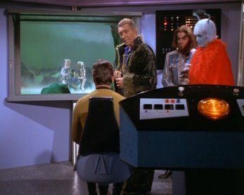
edit: Did anyone notice that one of the earliest episodes had Scotty wearing the same insignia he wore later on as identified as a mistake by ZapBrannigan?

Are we really so sure as to the meaning of these insignias?

Yes, after the second pilot episode the science insignia and the ship services insignia were switched on the uniforms. That is why Scotty is wearing the science insignia in the second pilot episode and Astro-sciences physicist Sulu and Dr. Piper (and Dr. Dehner) are wearing the ship services insignia in the second pilot episode.


Navigator NCC-2120 USS Entente
/\
 
Last edited:
Yes, after the second pilot episode the science insignia and the ship services insignia were switched on the uniforms. That is why Scotty is wearing the science insignia in the second pilot episode and Astro-sciences physicist Sulu and Dr. Piper (and Dr. Dehner) are wearing the ship services insignia in the second pilot episode.

I guess what I'm getting at is this: how do we know that the insignias mean "science" and "ship services" since they were used differently in the same series run? Example: Scotty goes from circular insignia in "WNMHGB" to reverse-C for many episodes and then sports the circular one again in "Lights of Zetar". And then the circular one again for more episodes. It doesn't sound like a mistake since the meaning of the insignia is not established and he had worn it previously.

Other ships (like the Constellation) don't appear to even have room on their insignia to differentiate between services (see Decker's insignia).

edit: Could the insignia be more of a ship or fleet identification rather than an indicator of service? Or something else entirely? The shirt colors already seem to suggest different services.
 
Last edited:
Yes, after the second pilot episode the science insignia and the ship services insignia were switched on the uniforms. That is why Scotty is wearing the science insignia in the second pilot episode and Astro-sciences physicist Sulu and Dr. Piper (and Dr. Dehner) are wearing the ship services insignia in the second pilot episode.

I guess what I'm getting at is this: how do we know that the insignias mean "science" and "ship services" since they were used differently in the same series run? Example: Scotty goes from circular insignia in "WNMHGB" to reverse-C for many episodes and then sports the circular one again in "Lights of Zetar". And then the circular one again for more episodes. It doesn't sound like a mistake since the meaning of the insignia is not established and he had worn it previously.

Other ships (like the Constellation) don't appear to even have room on their insignia to differentiate between services (see Decker's insignia).

blssdwlf,

I understand what you are saying. However, during "The Lights of Zetar" episode, Scotty's insignia changes during that episode from the ship services insignia to the science insignia and back. I am not aware of any other time this happens to this character in another episode.

Yes, I agree with you that Commodore Decker's insignia should have a black star on it to designate it as a command insignia.


Navigator NCC-2120 USS Entente
/\
 
I'm imagining Marta's explosive demise in "Whom Gods Destroy" and wondering if the CGI artists should have added a big splash of green blood smacking the window and running down, leaving a stain.
3_14_14_zps879fa76a.jpg


In other words, should they have traded historicity for impact?

The CGi was very restrained throughout the series, and I wonder if they could have done a little more here and there without straying too far from the original feeling. Note that the original was restrained by a combination of budget, technology, and the broadcast standards of the time, so it wasn't necessarily the "intent" of the creators.

Yes they could and should have done more. Still, we know how much care CBS-Digital puts into it's work. What we got was as good as it can get under the purview and conditions set.

RAMA
 
Honestly TOS-R needed a knowledgeable VFX director on it—someone with a background in or understanding of how optical effects work on FILM—in order to make the effects fit seamlessly into the show. The big problem with the TOS-R effects, beyond the dumb boo boos (e.g. the orange "blue flame" and the Enterprise actually vanishing behind the limb of a planet...which would make said planet about 10 miles across) and crappy models (hel-lo low poly Klingon ship) is that the effects don't feel like they belong next to the footage that surrounds them in terms of LOD (level of detail), grain and lighting style.
 
Last edited:
Honestly TOS-R needed a knowledgeable VFX director on it,—someone with a background or understanding of how optical effects work on FILM—in order to make the effects fit seamlessly into the show. The big problem with the TOS-R effects, beyond the dumb boo boos (e.g. the orange "blue flame" and the Enterprise actually vanishing behind the limb of a planet...which would make said planet about 10 miles across) and crappy models (hel-lo low poly Klingon ship) is that the effects don't feel like they belong next to the footage that surrounds them in terms of LOD (level of detail), grain and lighting style.

I wholehearted agree.
 
And Ann Mulhall could have a doctorate in an engineering field, right? Or does the script contradict that? I think someone on the bbs postulated that as an explanation for her in her fetching red outfit, nom nom.

Nom nom nom, I quite agree.

But she introduces herself as Dr Ann Mulhall, Astro-biology.

My own double-talk explanation would be that above a certain rank, or in certain back-water departments, officers can choose their own uniform color based on personal preference. This isn't like the flight deck of an aircraft carrier where the shirt colors of guys running around in a life-and-death situation have to be visible from the bridge. It's more like living in the International Space Station, almost casual.

And it just so happens that most women looked best in the red dress. Does the name Yoeman Teresa Ross mean anything to you guys? Nichelle Nichols hated the "plain" command color she wore in "The Corbomite Maneuver" and couldn't get out of it fast enough. She wanted red.
 
Honestly TOS-R needed a knowledgeable VFX director on it—someone with a background in or understanding of how optical effects work on FILM—in order to make the effects fit seamlessly into the show. The big problem with the TOS-R effects, beyond the dumb boo boos (e.g. the orange "blue flame" and the Enterprise actually vanishing behind the limb of a planet...which would make said planet about 10 miles across) and crappy models (hel-lo low poly Klingon ship) is that the effects don't feel like they belong next to the footage that surrounds them in terms of LOD (level of detail), grain and lighting style.

Good points!

Your size-of-planet comment reminds me of a shot in the opening credits of STAR TREK VOYAGER, which were done by Disney if I recall correctly. They show Voyager coasting over the rings of a gas giant, but the ship's reflection in the rings is so big, it would make the planet absurdly small.
 
The mistakes are not just restricted to TV series. For example, near the end of TMP, Spock and McCoy are wearing each others field jackets. McCoy's field jacket has the green stripe (for medical division [or science division, medical branch, if you prefer]) and Spock's field jacket has the orange stripe (for science division).

Here is the mistake courtesy of trekcore.

Here is a link to information about the Starfleet Uniforms from TMP courtesy of Memory-Alpha.


Navigator NCC-2120 USS Entente
/\


I never noticed that. Now that you mention it, the jacket is too short on Nimoy and too long on Kelley. That's pretty dumb.

But I could have watched TMP a thousand times and never picked up on the color coding. It was too small on the uniform, and the film itself doesn't inspire me enough to bother studying its details.
 
Honestly TOS-R needed a knowledgeable VFX director on it—someone with a background in or understanding of how optical effects work on FILM—in order to make the effects fit seamlessly into the show. The big problem with the TOS-R effects, beyond the dumb boo boos (e.g. the orange "blue flame" and the Enterprise actually vanishing behind the limb of a planet...which would make said planet about 10 miles across) and crappy models (hel-lo low poly Klingon ship) is that the effects don't feel like they belong next to the footage that surrounds them in terms of LOD (level of detail), grain and lighting style.

Agreed 100%

Aside from the video game FX, the biggest mistake of both TOS and TOS-R was the scale of shuttlecrafts in the hangar. How can anyone believe the occupants of a shuttle that large (if we consider the cutaway diagrams or actual footage) would fit into a bridge as small at it is assumed to be on the same cutaway?

All explanations/diagrams have never made sense of that, and one would have thought for all of the unnecessary TOS-R changes, the shuttle size issue would have been a no brainer.
 
Does anyone think it possible they may attempt an additional re-master for the 50th anniversary in 2016?

Not starting from scratch of course, but just building on what has already been achieved to date. I’m also thinking about how this would be an opportunity to finally fix certain on-screen faults that weren’t corrected the first time due to time & budget restrictions.

Possible in what sense of the word?

The answer is no.
 
Possible as in it being the important 50th anniversary of the show and therefore wanting to promote it with something like a special anniversary release 10 years after the first Blu-ray release.

Additional revenue being the motive, they would have to consider that many people might be interested in buying such a release on what is a significant anniversary if it contained more enhancements & fixing up all the faults missed last time.
 
Honestly, why not? Does anyone think that CBS/Paramount would pass up any possible opportunity to squeeze more money out of the series? They practically invented the "double-dip" concept.
 
I'll be very shocked if they spend more money on remastering/remixing just for another Blu-ray release. Sure, they could slap together or blow the dust off a special feature or two for a new set, but the TOS-R we got with its second-string CGI was the very model of cheapness to begin with. Why spend a lot more money, for just as much return?
 
The thing is, I believe they already thought they were going too far at times. Occasionally there are some ship maneuvers that are just fancy for the sake of it, like the rendezvous with the Medusan ship near the end of "Is There in Truth..." (which had no analog in the original and didn't need one; right after Kirk says "Miranda...?" and looks down the empty, fisheye-lensed corridor, the original has a stock shot that went beautifully with the music cue: rear of Enterprise in foreground, the Medusans' planet in distance).

Nonetheless I'm satisfied in general. They knew, for example, what to essentially leave alone although the image was entirely new - such as the first shot of act I of "Metamorphosis," the Companion's planetoid hanging in center screen (with the title and other credits superimposed).
 
I'm doing a same-screen old episode vs remastered TOS for the very first time. I'm really blown away. I've never done a comparison of TOS on this scale before, I plan on looking at about 10-12 complete episodes this way. First up was The Cage...which has some of the very best clarity changes in HD compared to the washed out original. Love the seamless transition of the opening credits to the interior of the bridge. I only wish they had added some video to the bridge's secondary screens. Second was Ultimate Computer. The new space station is one of my favorite changes of the whole series. Third was Doomsday Machine. Oddly enough the HD transfer seems less pronounced on this episode. Obviously this one was the most FX heavy of TOS's run, and they are also quite obviously awful...this episode is a great example of how FX, staging and composition actually help the episode become better in TOS-R. also admire the proper blues seen on the Enterprise bridge as opposed to he purple hue from the original. Next up Tholian Web!!

...and I thought I wouldn't be watching TOS again for years!!:techman:

RAMA
 
I personally think TOS-R "The Doomsday Machine" is one of the worst of the TOS-R episodes. In my opinion at least the original effects looked better than the cartoons that replaced them. The texture on the doomsday machine itself was just pathetic. Don't even get me started on the interior of the machine or the super cartoon looking force beam that it emitted. It really renders one of my favorite TOS episodes unwatchable for me. To me the remastered effects were nothing more than a gimmick but I'm glad to hear that some like them.
 
If you are not already a member then please register an account and join in the discussion!

Sign up / Register


Back
Top