• Welcome! The TrekBBS is the number one place to chat about Star Trek with like-minded fans.
    If you are not already a member then please register an account and join in the discussion!

How Far Should TOS-R Have Gone?

  1. Finally, the big fault of the remastered effects is that they frequently demonstrate that the new effects team didn't understand basic cinematography. Example: the battle sequence in Elaan of Troyius is a complete mess in terms of basic (and I mean Film Composition 101) directional continuity.

This is my biggest complaint too. Another example is the orbital shot of Apollo's hand holding the ship. Crappy composition - your eye doesn't know where to look to get the point of the shot.
You mean this mess?
http://tos.trekcore.com/hd/albums/2x02hd/whomournsforadonaishd0195a.jpg

I'd like to see TAS remastered with better hand drawn animation (or CGI augmented hand animation), but full CGI would totally destroy the charm of it. Some of us prefer our cartoons one-dimensional :)
One dimension is a straight line. :)

I think that screencap looks quite good, actually. I mean, really, what else can you do with a giant green hand from outer space grabbing the saucer section of your starship? How convincing can something be in that situation?
 
It's not about being convincing (in this case), it's about bad composition. The entire visual balance of that image is strongly weighted to screen right, creating an off-balance sense. And the intersection of the hand and the Enterprise's saucer is smack dab in the center of the screen and set right on top of the planet's horizon. The result is an unbalanced visual jumble. The rules of composition have been discarded and a number of cluttered element are concentrated in the middle of the image, resulting in a lack of focus.

It's poor quality work. If you don't believe me, believe Maurice; he does this stuff for a living.
 
A good composition directs your gaze. The hand shot has too much detail on one side of the image, what with the hand overlapping the planet, etc., so it becomes clutter and the eye wants to jump off into the negative space to the left.
 
This is my biggest complaint too. Another example is the orbital shot of Apollo's hand holding the ship. Crappy composition - your eye doesn't know where to look to get the point of the shot.
You mean this mess?
http://tos.trekcore.com/hd/albums/2x02hd/whomournsforadonaishd0195a.jpg

I'd like to see TAS remastered with better hand drawn animation (or CGI augmented hand animation), but full CGI would totally destroy the charm of it. Some of us prefer our cartoons one-dimensional :)
One dimension is a straight line. :)

I think that screencap looks quite good, actually. I mean, really, what else can you do with a giant green hand from outer space grabbing the saucer section of your starship? How convincing can something be in that situation?

I like it, too. Instead of the hand floating in space, it's coming from the planet, like Apollo reached up from his temple. Maybe it should be framed differently, but I don't see a problem, but I'm just a consumer, not a creator, so I don't have any technical know how or talent for that matter. There does seem to be a lot of empty space on the left, however.
 
A good composition directs your gaze. The hand shot has too much detail on one side of the image, what with the hand overlapping the planet, etc., so it becomes clutter and the eye wants to jump off into the negative space to the left.

I just took a look at it and couldn't believe it. I've only seen some slivers of TOS-R and found them falling between abysmal and mediocre, but this just looks like it was put together in a few minutes, maybe somebody's first try with photoshop. Is this the worst of TOS-R?

Don't know how many of you will remember, but during Desert Storm I, TIME had a two-page photo of the oil fields. Bottom third of the frame was soldiers on ground facing away, middle was rocky ground terrain, upper part burning oil wells in distance. Classic composition, right?

Except the shadows didn't match direction and intensity from bottom to middle.

I showed it to everybody I worked with and NO ONE saw anything wrong with the image. Even my stepdad, who has the sort of eye that just finds stuff wrong automatically. It's like by appearing in TIME (or on the cover of LIFE in a different era), it has a stamp of approval that generates blinders or something. Not sure if the same pseudo-standards apply with other media, but I'm kinda wondering now.
 
It's not about being convincing (in this case), it's about bad composition. The entire visual balance of that image is strongly weighted to screen right, creating an off-balance sense. And the intersection of the hand and the Enterprise's saucer is smack dab in the center of the screen and set right on top of the planet's horizon. The result is an unbalanced visual jumble. The rules of composition have been discarded and a number of cluttered element are concentrated in the middle of the image, resulting in a lack of focus.

It's poor quality work. If you don't believe me, believe Maurice; he does this stuff for a living.

I see what you're saying, but my eyes seem to focus right on it without any trouble.

A good composition directs your gaze. The hand shot has too much detail on one side of the image, what with the hand overlapping the planet, etc., so it becomes clutter and the eye wants to jump off into the negative space to the left.

I should be more clear; it's that it doesn't bother me. I realize, Maurice, that you are correct in that it's probably poorly composited, but my eyes still see it as acceptable.

Don't feel bad, it's likely that my eyes have issues of their own (which they do). :lol:
 
The shots they did with the physical 1701 model for the DS9 Tribble episode are a million times better than the best CGI shot in TOS-R.

Agreed. There's no digital replacement for a physical, detailed body, and your example--compared to TOS-R--proves the point.

Financially it is just impossible to shoot miniatures mo-con economically anymore, according to everybody. I do not understand why, and it is a question I've been asking industry professionals for 15 years. Always the same vague 'stage costs too high/system rental too high' which just seems very unlikely given the budgets allocated.

Interesting.

I always found the economic issue suspect, as a TOS job--if simply replicating all original shots--is not the Return of the Jedi space battle over Endor. Many seem to forget just how vast the TOS universe appeared--like the 1701 really had to travel just to run into another vessel (part of the appeal, rather than overpopulated, Star Wars-esque space scenes).

Following the TOS path, certain new flybys could be recycled as much as the original FX shots (if so desired)--only with completely clean work. Add the rare extra element (Klingon, Romulan, K-7, Aurora, Tholian, etc.), and its nowhere near the cost of a full production of modern hour-long TV.

Instead, we were "treated" to the hokey, dated out of the gates TOS-R, which is no more realistic than graphics for the common Wii game.
 
I have a couple of problems with TOSR. First of a,ll Eden FX (the company that did the FX for In A Mirror Darkly) put in a bid for the job by doing some test shots for Tomorrow is Yesterday (pix below) but CBS decided to play it cheap and went with their own "in house" effects crew. Another problem is that the Enterprise (a character in her own right) looked too flat, cartoony and digital. The real model approach of Trials and Tribble-ations would have flowed much better. I must admit that some of the matte paintings were quite nice however, but all in all a missed opportunity for a show that deserves the utmost respect and effort. I also found their approach inconsistent. Some things were fixed, some not. :)
cbseden-firstattempt.jpg
eden-jpg.jpg
EDEN-CBS.jpg
FXCOMPARE.jpg
 
Last edited:
Oh, and I read a few mentions of Star Wars here, so in keeping that spirit, this is what I think would happen if Gary Mitchell met Darth Vader ;)
darth01.jpg
darth02.jpg
DARTH03.jpg
 
Oh and a "fun" illustration of my point about using a model. I made this effects sequence with a 3 foot Master Replicas model of the Enterprise. The client wanted the TARDIS pulling the Enterprise into a time tunnel so this is what I came up with. :)https://vimeo.com/10517641
 
I wish these guys would stop looking at other effects as reference and look at real-world objects, like an actual Navy ship, to see how much or little detail is necessary to sell scale.
 
There's that realworld aspect, yes, and obviously it is ignored in large part. But there's also an aspect that gets very little play in cinematic circles or any other -- lens choice.

The default thinking with models is always use the shortest, i.e. widest angle lens, because it allows for better depth of field and can permit you to do paintscraper shots with the model a fraction of an inch from camera. And if you put an infinite amount of detail onto the miniature and shoot it just right, this approach works very well very often (look at opening of STAR WARS.)

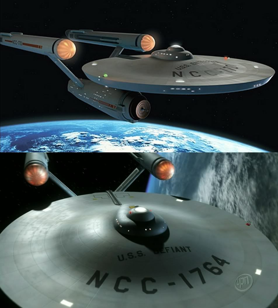
But if you use a longer lens, more of a telephoto look (think binoculars), you're capturing the object from a greater distance, which is what you are doing with fullsize objects. Problems with this include being able to get far enough back from the model, which has to be pretty good size, and the aforementioned depth of field.

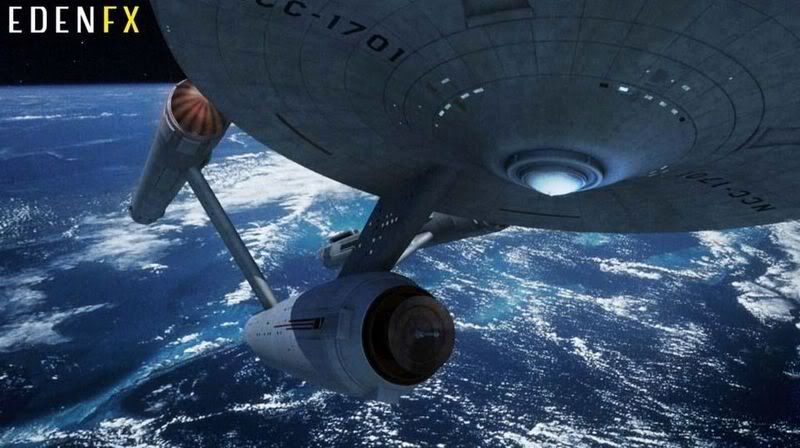
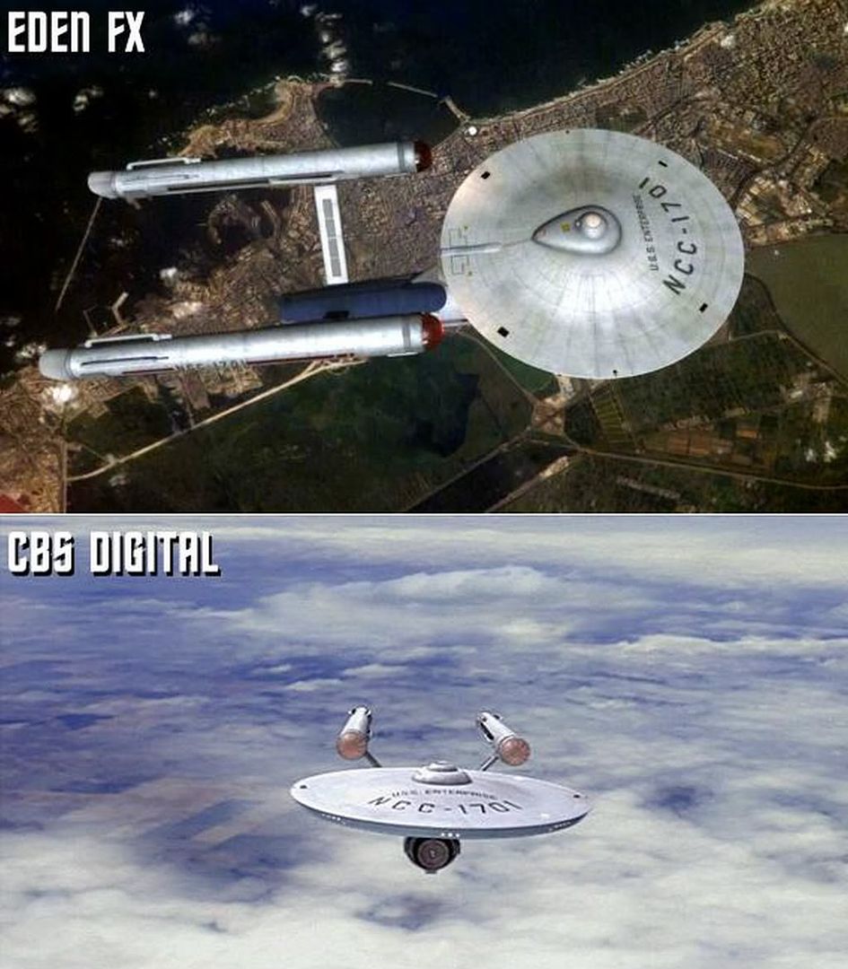
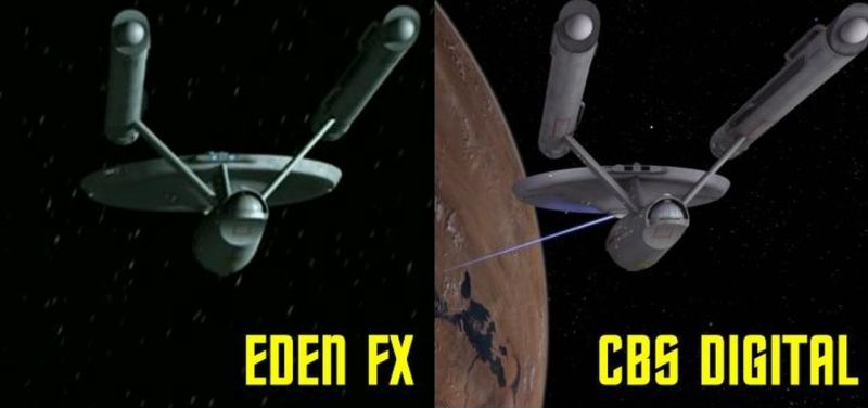
But my viewing studies indicate that this allows you to get a sense of the model overflowing the camera view as it comes to camera, which is what you see on TOS on a number of the close flybys, which really gives it a sense of size like you're watching a cruise liner come pass you by -- that you can't get back far enough to take it all in. And oddly, if you look at a lot of TNG shots that are done in a similar way, there is sometimes something of a credibility issue -- and it is because the ship doesn't get big enough to overflow the field of view (gotta find a bette word than overflow, but hoping you know what I mean.) At a certain point, you can tell that the object is not much bigger than the camera -- and that is due in part to the model being 4 ft instead of 8 or 11, and in part because of the camera field of view.

Next time I talk to the guy I think of as 'the last miniature shooter' (and he's not, there are three or four guys left who do it, but it really IS a vanishing art now), I think I'm going to try asking him about this. I don't think he ever used telephoto lenses on ship stuff, but he may have for some of the golden gate bridge stuff in XMEN 3, which mixed a very large miniature with a lot of CG.

Given I'm so totally in favor of using miniatures when they are the best tool for the best job, it may sound odd but I was distinctly unimpressed with all of the ship / station exteriors in DS9's tribble show. The lighting was so uncontrasty, verging on flat, that it looked like it was done digitally, since CG has a tendency to have dynamic range issues that usually 'milk out' the image to a certain degree. It may have been that once the model photography was scanned, the image was manipulated in an unflattering way, or else it was a deliberate call on the part of VFX or production. But I thought it all looked out of place not only in terms of TOS, but also in terms of DS9,which had a much better contrasty look than most early/mid TNG (DS9's pilot opening shots w/ Borg are pretty hot.)
 
If you are not already a member then please register an account and join in the discussion!

Sign up / Register


Back
Top