• Welcome! The TrekBBS is the number one place to chat about Star Trek with like-minded fans.
    If you are not already a member then please register an account and join in the discussion!

Wrath of Khan – my favorite design

Status
Not open for further replies.

neoworx

Lieutenant
Red Shirt
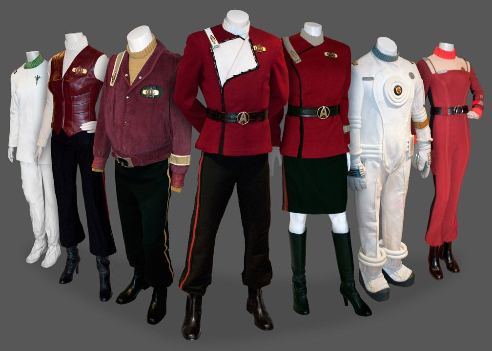
More than thirty years after i originally saw it, Wrath of Khan remains as my favorite 2 hours of Star Trek. One of the main aspects that I've always loved was the new costume designs that Robert Fletcher introduced at the behest of director Nick Meyer. Because of that, I've spent several years putting together a collection of screen-used pieces that center on the movie stuff from ST2-6.


Check it out here:

wrathofdhan.com
 
Last edited:
I gotta say, I just don't remember the leather female top. Getting old. Did Saavik wear it under her field jacket in The Search for Spock?
 
Yes, the costumes introduced in Wrath of Khan were great. They were sharp, functional, and looked like officers uniforms of a ship like the Enterprise, should. I have to say though, that I have a penchant for the colorful uniforms of TOS :). Anything is better than the pajamas that they wore in The Motion Picture.
 
One thing I noticed was the production of III allegedly couldnt change the uniforms again after II because of the expense (also I dont think anybody thought it was needed). But II had a LOT of new costumes: the civilian clothes for all the heros, all the Vulcans including Spock's white robe that was used in IV, The "bomber jacket" used by Scotty who was getting fatter but alto the Admiral, the waitress and Yoda, at the bar, They really sewed a lot for III
 
This is actually my second favorite design after the uniforms with the gray tops that started in First Contact. The rest look like stuff you would wear to bed or, in the case of Enterprise, something you would wear right before you skydove or something. These look and feel like uniforms, even though I never really understood the bib part. What was that supposed to represent.
 
These look and feel like uniforms, even though I never really understood the bib part. What was that supposed to represent.

I had the same question. I think it was supposed to be reminiscent of either 18-19th century naval uniforms or US Army Union officer uniforms from the Civil War. I think the white part might have been put there for the bloody hand print on Kirk's uniform for dramatic effect, though.
 
I do love the uniform designs for TWOK. The movie uniforms are still my favorites concerning the classic movies.
 
I too really like these, although not my favourite as the ones from the new movies and FC edge out 1st and 2nd but they come in a close 3rd (and at times move up the order depending on my mood).

The one thing I dont like about these after all this time are the trousers and boots, they just dont seem to have aged as well as the top half which still looks sharp.

A far more heroic look for Starfleet than whatever you can call the TMP uniforms, with few exceptions of ideas which just didnt work out as well as they could have.
 
The TWOK uniforms are much more like an extension of the TOS uniforms. Especially the pants and boots combo. :) The only thing I didn't personally like about them was the belt and it's slightly-too-conspicuous buckle. I'm not sure what I'd have replaced it with though, and the uniform as designed might have looked a little odd without it. But... I dunno, it's the only bit of the uniform that crosses the line into being over-stylized for me. I love the rest of it.
 
I'm still not convinced that the TMP uniforms weren't just painted straight onto their bodies. Shatner, Nimoy et al are probably walking around completely naked in that movie.
 
even though I never really understood the bib part. What was that supposed to represent.
That's an open flap. IIRC, we see Kirk opening and closing the flap in TWOK. The female uniform in the picture is an example with the flap closed.

Not sure what the point is, though, when there's just more jacket underneath. Might loosen it up a bit in the neck/chest area. Also not sure offhand if all the uniforms came with this feature, or it was just there on the "hero" costume (Kirk's).

We saw McCoy open his and I think there's a shot in TWOK where Saavik has hers open.
 
The TWoK uniforms are the most 'believable' in the sense that you see a diverse range of uniform types in TWoK (and even more in the subsequent films) for different taks and crew, as you would imagine the case in a real (semi-)military organisation. I know this is due to real-world budgetary limitations, but it's always bugged me that in the various TV series, we rarely if ever see a variety of uniforms on the crew apart from the standard ones.

Incidentally, weren't the TWoK uniforms originally going to be gold, blue and red, keeping the TV show divisions scheme, but the chosen gold and blue colours didn't film satisfactorily? Am I remembering that factoid correctly?
 
Costume designer Robert Fletcher made up a series of color samples with the maroon color being chosen because director Nick Meyer liked how it stood out against the background of the bridge set. I've never heard of them specifically considering the TOS colors, but it had to at least cross their minds.

They were also limited by what colors they could dye the TMP jumpsuits since they needed to save money and reuse TMP pieces as much as possible. The maroon color worked well so TMP jumpsuits were dyed and modified to become the WOK crewman uniforms.

As for the flap on the maroons, Meyer wanted a swashbuckling feel to the uniforms and used moves like "Horatio Hornblower" and "The Prisoner of Zenda" as style references.


The flap was simply a functional bit of the uniform that the actors sometimes used. Usually they were only opened when something happened – life support goes out and the bridge gets hot, for instance. The flap interior color also designated rank levels– white for command level and tan for everything else. The flaps were always functional, even in background pieces. I showed the center uniform with an open flap to show command – it's Spock's from ST4. The other – Rand's – has a tan interior.

See more HERE.
 
Status
Not open for further replies.
If you are not already a member then please register an account and join in the discussion!

Sign up / Register


Back
Top