Here is something I'd love to see. I know many of us in our fandom have tried to build our own home control consoles, whether it be something simple like a page taped to a desk or dresser, or building a full unit out of cardboard or even wood. Many of us have dreamed of being on the bridge, and worked our creative muscles to visualize it in a physical manner. I would like to see all of yours.
Of course it is only fair to share mine. While I don't have a catalog of everything, I do have a specific effort I made, built out of wall shelves, with matting board made to construct the angular surface of the panels. The rest were just printed graphics layered in clear packing tape to give the plexi-looking finish (and of course to protect it from greasy finger smudges).
BIRTH OF THE WALL PANEL (The Motion Picture):
My first attempt was in a Motion Picture style, as this was shortly after I found the "Enterprise Flight Manual" on the cygnus-x1 blueprints page, outlining all of the control panels intended for the Star Trek Phase II bridge. Of course this sparked my geekdom in a massive way, and this was the result


It wasn't really based on any specific panel, as there are pieces from all over, though many ended up being similar in design. It was at this point that I realized how plain it actually looked. The only part I was truly happy was the Fuel Management display on the wall, which was a combination of a wall and surface display in the Engineering panel,... the one we get the least glimpse of in the movie (probably because Scotty never sat there. And I realized why, because there was nothing for the actor to do, as it was all displays, no actual buttons).
FIRST UPGRADE (Generations):
I grew tired of this design quite quickly. My favorite console designs have always been the Final Frontier - Generations era, and this became the focus of my first upgrade to the panel. All the structure remained the same, as there was no real reason to change it. Fortunately I planned ahead and ribbed it underneath so it would remain solid, rather than bending inward every time I touched it. I wanted to make an Enterprise-A design, but it turned out to have more of an Enterprise-B feel once I had the new design completed.
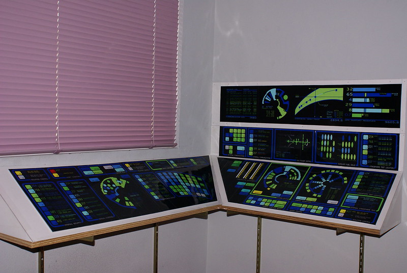


It was again a mixture of a variety of elements, particularly the top row of displays being Voyage Home era rather than Generations. If you look closely though, I did more than just random colors and numbers. I had really planned out functions for each panel and the buttons within, even on the curved input panel.
Something that happened purely by accident, some of the panels were in the same place as they were on the Voyage Home version. Environmental test on the far right, maintenance in the middle of the left panel and internal security on the far left. Interesting the way things work out now and then. I did get a lot of time and love out of this version, but of course (as is the nature of A.D.D.) I had a new idea I wanted to try.
SECOND UPGRADE (The Original Series):
One day I was wandering through Michael's (art supply) and found some colored translucent mosaic pieces. While not as large as the molds that made the Original Series panels, they still offered the opportunity for something tactile. I found some half-sphere pieces too, and the urge immediately hit to build something TOS style.
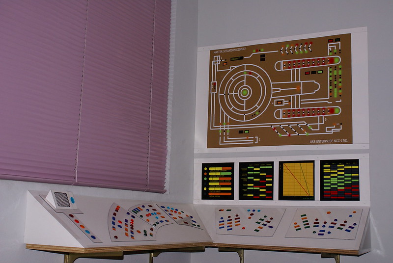
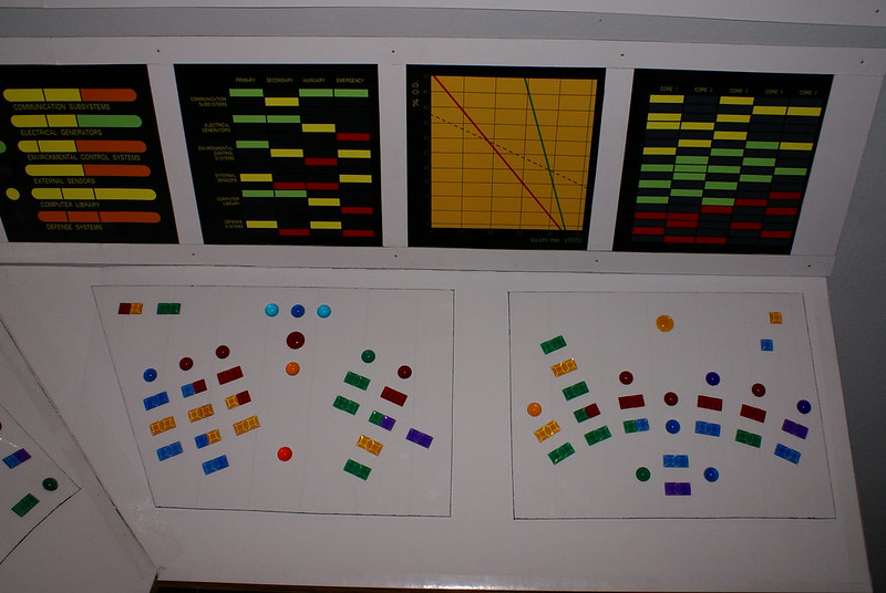

I think this is the one I was the most happy with of all of them. The tactile nature of it (as previously mentioned) did help a lot. Plus I loved having a legitimate curved ergonomic style console, as they always seemed to pop out at me the most, from a design standpoint. That isn't to say it didn't require photoshop work like the earlier panels, namely the wall displays. I should note that the top MSD display was not my creation. While I did make it in photoshop from scratch, the original design was from one of the talented designers on the old Okudagrams.com forums (before it was destroyed by hackers).
This was the final console to be fully realized before those shelves were finally removed.
OTHER WORK IN PROGRESS DESIGNS:
That isn't to say I made some other design efforts, as it seemed like every month my interests shifted. There was always so much to draw from. Like, for example, the curved ergonomic console I mentioned. There was always something about the Enterprise-A-B style I wasn't quite happy with, and I attempted to design an upgrade to a full curve style. I completed the basic design in Photoshop, but never got around to coloring or assigning font to them (aside from the large console names)


I think I can honestly say, this is the one I was most disappointed to not make a complete version of, as I was EXTREMELY pleased with the overall design. I think I am out of chronological order here, as this may have been the one that inspired me to build a whole wall unit, rather than relying on shelves, but I will save that design for last.
Another upgrade that got a bit more work completed shifted ahead a century to Next Generation / First Contact era
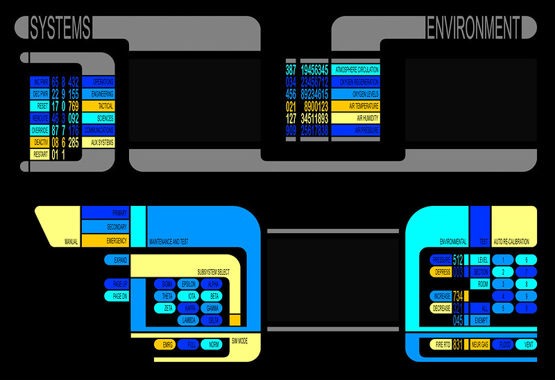

It should be noted that the top image includes bot the console and the wall display combined together. I never got around to designing the screens that would fill in the blank areas, but it was my intention to do so.
I had even begun laying out a Voyage Home version, but never got around to making it in Photoshop (in any manner worth posting here, so I snapped a picture of the sheet I drew it out on instead)

Even the blank nondescript ovals were having functions and values assigned to them. That is how obsessed with details I get, LOL
FINAL UPGRADE:
Finally, I had torn down the shelves, as they weren't exactly the most sturdy structure in the world. Its not like my alternative was MUCH better, as instead of wood (which was too expensive) or cardboard (which was too cheap) I built an entire structure out of poster board. While I never took a picture of the unit itself, I did still have the photoshop file with the control console, which is easy my favorite, and why I saved it for last. Not just the design, which I was very happy with, but all the detail that went into assigning functions to everything.

The sad part is,... even though I printed everything out, the panel never got fully made because... like a moron, I clicked "fit to page" instead of "actual size", and that was when our printer went kaput. .. and I wasn't about to spend $50 to have OfficeMax or the FedEx store print it out LOL
Anyways, that concludes my home console project journey. I would love to see what some of you have done in your home console crafting journeys, whether it be structural or graphical
Of course it is only fair to share mine. While I don't have a catalog of everything, I do have a specific effort I made, built out of wall shelves, with matting board made to construct the angular surface of the panels. The rest were just printed graphics layered in clear packing tape to give the plexi-looking finish (and of course to protect it from greasy finger smudges).
BIRTH OF THE WALL PANEL (The Motion Picture):
My first attempt was in a Motion Picture style, as this was shortly after I found the "Enterprise Flight Manual" on the cygnus-x1 blueprints page, outlining all of the control panels intended for the Star Trek Phase II bridge. Of course this sparked my geekdom in a massive way, and this was the result
It wasn't really based on any specific panel, as there are pieces from all over, though many ended up being similar in design. It was at this point that I realized how plain it actually looked. The only part I was truly happy was the Fuel Management display on the wall, which was a combination of a wall and surface display in the Engineering panel,... the one we get the least glimpse of in the movie (probably because Scotty never sat there. And I realized why, because there was nothing for the actor to do, as it was all displays, no actual buttons).
FIRST UPGRADE (Generations):
I grew tired of this design quite quickly. My favorite console designs have always been the Final Frontier - Generations era, and this became the focus of my first upgrade to the panel. All the structure remained the same, as there was no real reason to change it. Fortunately I planned ahead and ribbed it underneath so it would remain solid, rather than bending inward every time I touched it. I wanted to make an Enterprise-A design, but it turned out to have more of an Enterprise-B feel once I had the new design completed.
It was again a mixture of a variety of elements, particularly the top row of displays being Voyage Home era rather than Generations. If you look closely though, I did more than just random colors and numbers. I had really planned out functions for each panel and the buttons within, even on the curved input panel.
Something that happened purely by accident, some of the panels were in the same place as they were on the Voyage Home version. Environmental test on the far right, maintenance in the middle of the left panel and internal security on the far left. Interesting the way things work out now and then. I did get a lot of time and love out of this version, but of course (as is the nature of A.D.D.) I had a new idea I wanted to try.
SECOND UPGRADE (The Original Series):
One day I was wandering through Michael's (art supply) and found some colored translucent mosaic pieces. While not as large as the molds that made the Original Series panels, they still offered the opportunity for something tactile. I found some half-sphere pieces too, and the urge immediately hit to build something TOS style.
I think this is the one I was the most happy with of all of them. The tactile nature of it (as previously mentioned) did help a lot. Plus I loved having a legitimate curved ergonomic style console, as they always seemed to pop out at me the most, from a design standpoint. That isn't to say it didn't require photoshop work like the earlier panels, namely the wall displays. I should note that the top MSD display was not my creation. While I did make it in photoshop from scratch, the original design was from one of the talented designers on the old Okudagrams.com forums (before it was destroyed by hackers).
This was the final console to be fully realized before those shelves were finally removed.
OTHER WORK IN PROGRESS DESIGNS:
That isn't to say I made some other design efforts, as it seemed like every month my interests shifted. There was always so much to draw from. Like, for example, the curved ergonomic console I mentioned. There was always something about the Enterprise-A-B style I wasn't quite happy with, and I attempted to design an upgrade to a full curve style. I completed the basic design in Photoshop, but never got around to coloring or assigning font to them (aside from the large console names)
I think I can honestly say, this is the one I was most disappointed to not make a complete version of, as I was EXTREMELY pleased with the overall design. I think I am out of chronological order here, as this may have been the one that inspired me to build a whole wall unit, rather than relying on shelves, but I will save that design for last.
Another upgrade that got a bit more work completed shifted ahead a century to Next Generation / First Contact era
It should be noted that the top image includes bot the console and the wall display combined together. I never got around to designing the screens that would fill in the blank areas, but it was my intention to do so.
I had even begun laying out a Voyage Home version, but never got around to making it in Photoshop (in any manner worth posting here, so I snapped a picture of the sheet I drew it out on instead)
Even the blank nondescript ovals were having functions and values assigned to them. That is how obsessed with details I get, LOL
FINAL UPGRADE:
Finally, I had torn down the shelves, as they weren't exactly the most sturdy structure in the world. Its not like my alternative was MUCH better, as instead of wood (which was too expensive) or cardboard (which was too cheap) I built an entire structure out of poster board. While I never took a picture of the unit itself, I did still have the photoshop file with the control console, which is easy my favorite, and why I saved it for last. Not just the design, which I was very happy with, but all the detail that went into assigning functions to everything.
The sad part is,... even though I printed everything out, the panel never got fully made because... like a moron, I clicked "fit to page" instead of "actual size", and that was when our printer went kaput. .. and I wasn't about to spend $50 to have OfficeMax or the FedEx store print it out LOL
Anyways, that concludes my home console project journey. I would love to see what some of you have done in your home console crafting journeys, whether it be structural or graphical
Last edited:


")