• Welcome! The TrekBBS is the number one place to chat about Star Trek with like-minded fans.
    If you are not already a member then please register an account and join in the discussion!

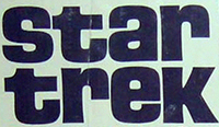
Gold Key Comics / Star Trek Annual title font

Stevil2001

Vice Admiral
Admiral
I recently saw the cover of Strange Stars, Jason Heller's forthcoming book about David Bowie and sci-fi in the 1970s: http://static.mhpbooks.com/strange-stars/

Of course, my eyes were immediately drawn to the fact that the title font is the same one as the Gold Key Comics and the UK annuals.

An old TrekBBS thread altered me to a downloadable typeface: https://www.dafont.com/trek-disruptor-blast.font?text=Strange+Stars&psize=l

But this appears to have been reverse engineered from the annual covers. Does anyone know if the Gold Key Star Trek font was unique to Star Trek publications, or was it used elsewhere in the 1970s?
Remco used that logo on its licensed wares, including the totally awesome utility belt:
5a13acba8c2146eb7193daff54fe06b1.jpg
It would be interesting to know who was responsible for that logo (Norway, Desilu, Gene's fixer); it seems a lot closer to Lost in Space than the fonts developed for the show.
 
Remco used that logo on its licensed wares, including the totally awesome utility belt:
View attachment 8056
It would be interesting to know who was responsible for that logo (Norway, Desilu, Gene's fixer); it seems a lot closer to Lost in Space than the fonts developed for the show.
Wow, I've never seen that before. It looks so cool! I had forgotten the Gold Key comics began as early as 1967, so that logo was already in circulation when the show was still on, though it looks like that was the only (?) Remco product to use it. Was there any other merchandise that used it before the modern era?
 
Of course, my eyes were immediately drawn to the fact that the title font is the same one as the Gold Key Comics and the UK annuals.

It is certainly close, but the S in the Star Trek one is much more rounded, whereas the S in Strange Stars retains the angular look of the other letters, in addition to other minor differences.

Does anyone know if the Gold Key Star Trek font was unique to Star Trek publications, or was it used elsewhere in the 1970s?

I don't know for sure, but I've done a little bit of searching, and haven't found anything yet.

Was there any other merchandise that used it before the modern era?

Funny you should ask that... I just recently was reading an article that was talking about Star Trek toys that didn't have much to do with Star Trek, and one of them was the Official Star Trek Sky Diving Parachutist (really), which used that particular logo. The linked site says it was from 1974 and was made by AHI, which Wikipedia says was Arzak-Hamway International, and which acquired Remco in 1974.

Most of the old toys seem to use this logo:

star-trek-toy-logo.jpg


which I haven't been able to find an exact match for yet, but which is somewhat close to/possibly based on? Eurostile Black. I haven't had a lot of time to search for this, but if anyone knows the answer, please jump in! :)
 
It is certainly close, but the S in the Star Trek one is much more rounded, whereas the S in Strange Stars retains the angular look of the other letters, in addition to other minor differences.


I don't know for sure, but I've done a little bit of searching, and haven't found anything yet.
Thanks! Good catch on the S.
 
I had the parachutist. Probably from Cunningham Drug Store (in the Detroit area).
 
If you are not already a member then please register an account and join in the discussion!

Sign up / Register


Back
Top